"There's nothing like a new set of app icon designs to start a debate. People still have strong opinions on Google's app icons. Now, it seems, it's the turn of Microsoft."
"It seems that Microsoft hasn't yet made a decision on what would be its first app icon makeover since 2018. According to Windows Central and a number of users on Reddit, the company has sent the designs out to a select group of users in a survey to get feedback."
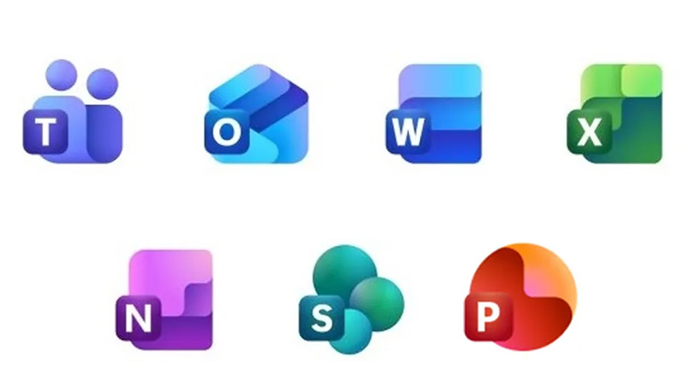
Microsoft is exploring design options for a new suite of app icons for its Office suite, following up on the Microsoft 365 rebrand. The proposed icons feature vibrant color gradients and a more three-dimensional look, steering away from the flat design that has dominated the industry. Feedback is being gathered through user surveys, with participation incentivized by a $10 gift card. Reactions are mixed, with some users appreciating the changes while others feel that the new designs may complicate rather than simplify the iconography.
Read at Creative Bloq
Unable to calculate read time
Collection
[
|
...
]