"Quang San Art Museum has unveiled a new rebrand, reflecting Vietnam’s artistic heritage through a modern design that balances visual enjoyment with emotional dialogue."
"The rebranding embodies the essence of 'Layers of Contemplation,' inspired by the construction of art pieces, utilizing elements like canvas and frame for unity."
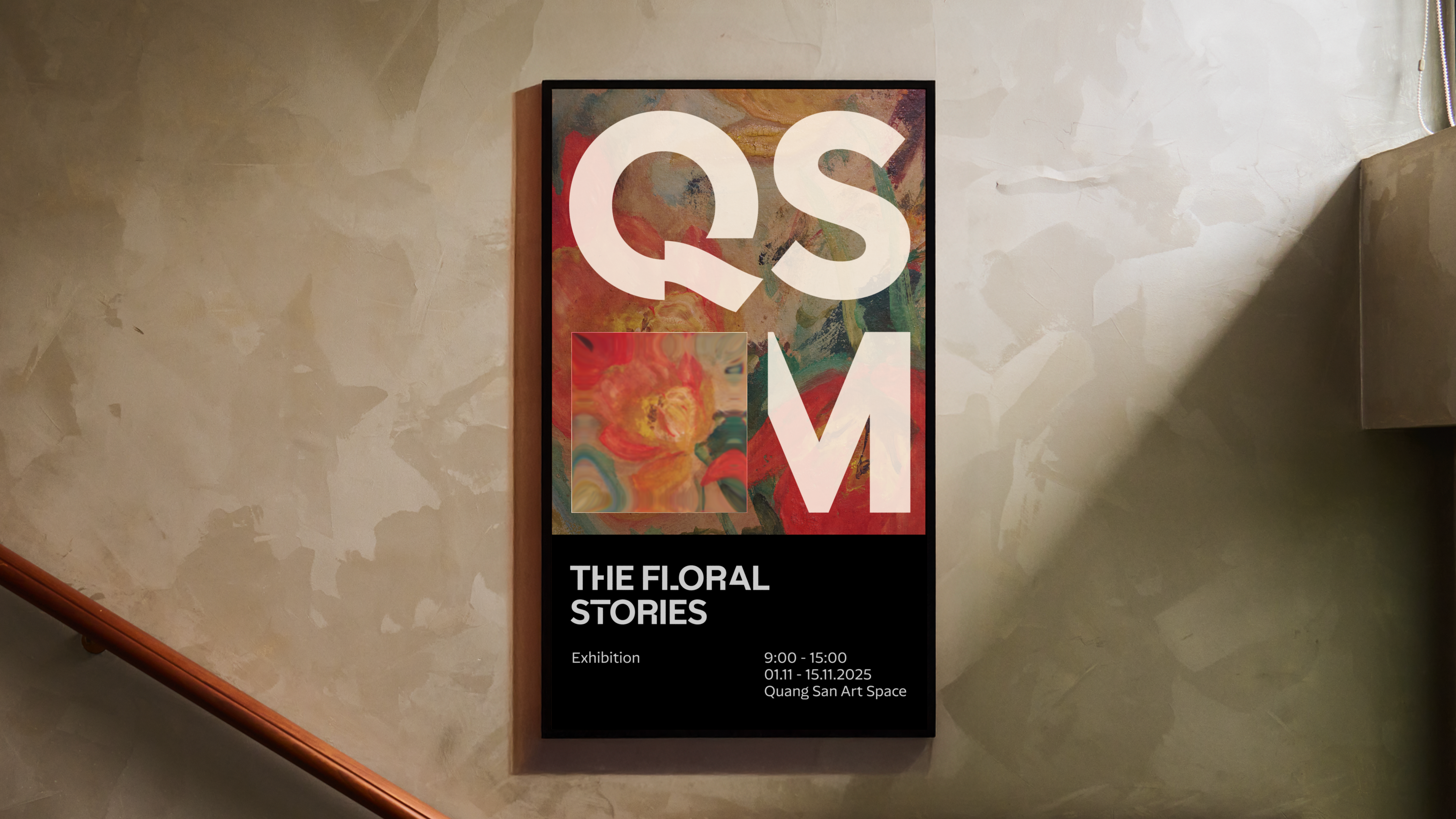
"QSAM's new logo features a rectangle symbolizing a blank frame or canvas, promoting contemporary flexibility while inviting contemplation and appreciating art's contemplative quality."
"The custom typeface QSAM Display contrasts sharp angles with curved features, evoking brushstrokes and reflecting the museum's architectural elements, enhancing the overall modern identity."
Quang San Art Museum has launched a fresh rebrand that combines Vietnam's artistic identity with modern design. The new brand identity, developed by M - N Associates, emphasizes the experience of art through a visual appeal that resonates emotionally. Notable aspects include a sharp new logo, the QSAM acronym, and a unique typeface called QSAM Display, reflecting the museum's architecture. The rebrand focuses on layers of contemplation, suggesting a connection between art elements like canvas and frame to create a unified aesthetic experience.
Read at Creative Bloq
Unable to calculate read time
Collection
[
|
...
]