"Pantone has officially called it: the prevailing mood for 2026 is exhaustion. This marks a sharp departure from recent years, when the annual announcement felt like a conversation happening in a different room. The world was navigating a pandemic hangover and digital burnout, while Pantone was prescribing electric purples for creativity and defiant magentas for bravery. Each choice, while commercially friendly, felt like a wellness influencer telling a tired person to simply manifest more energy."
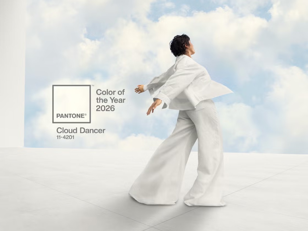
"This year, however, their choice of Cloud Dancer, a soft, billowy white, functions less like a statement and more like a surrender. It is the color of a blank page, an empty inbox, a quiet sky, a white flag, if you will. By choosing a hue defined by its peaceful lack of saturation, Pantone is finally acknowledging the dominant cultural mood - burnout. They are admitting that the most aspirational feeling right now is not vigor or joy, but rest."
Pantone selected Cloud Dancer, a soft billowy white, as the 2026 color, framing rest and quiet as the prevailing cultural aspiration. The hue conveys blankness, calm, and surrender—analogous to a blank page, empty inbox, quiet sky, or white flag. Previous picks leaned toward bold, energizing tones that often misaligned with social realities, such as pandemic hangovers, digital burnout, inflation, geopolitical instability, and anxiety about AI. Critics have characterized recent selections like Very Peri, Peach Fuzz, and Mocha Mousse as attempts to manufacture optimism rather than reflect grassroots moods. Cloud Dancer represents an admission that rest and low saturation now resonate more authentically.
Read at Yanko Design - Modern Industrial Design News
Unable to calculate read time
Collection
[
|
...
]