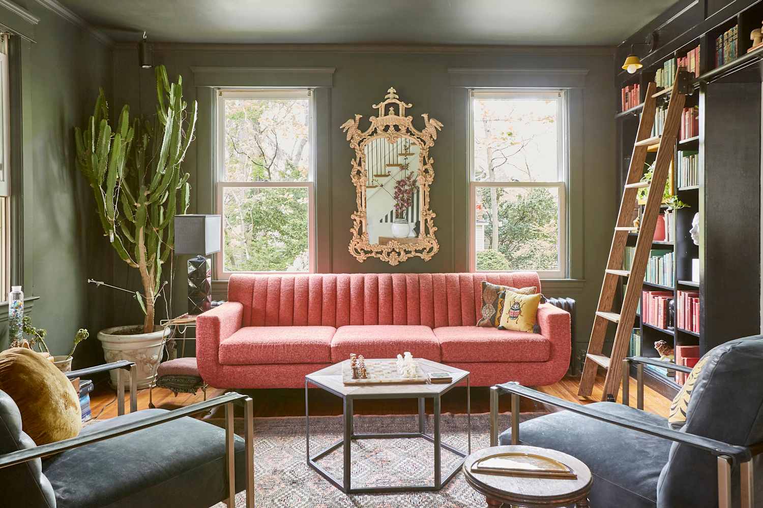
"The best part? For a shade with so much personality, olive green still plays well with others. Its current popularity can at least partially be attributed to the fact that so many hues pair beautifully with it, from chocolate brown to powder pink. It's a storied shade that masquerades as a neutral, giving designers and homeowners alike the best of both worlds as they build their palette and room's design scheme."
"It can be easy to go overboard in creating a custom palette, often due to a hue that's too boisterous for said space, or certain colors lending a frenetic energy. To help keep the calm that olive green naturally brings to the table, you want to balance out the saturation with the other colors you pick to complement it."
""Since our client loved pink, we decided to utilize olive as a neutral tone to help express and highlight the different shades in the space," Lagrange"
Olive green blends versatility with a neutral quality, pairing well with hues from chocolate brown to powder pink. The shade can serve as a calm backdrop or be dialed up by selecting more saturated companion colors. Balancing saturation helps maintain olive green’s serene mood and prevents overly boisterous palettes. Raw textures, flashy finishes, textiles, and upholstery enhance olive green schemes and add visual interest. Designers recommend using olive green as a grounding neutral to highlight accent colors and create cohesive, stylish interiors.
Read at Apartment Therapy
Unable to calculate read time
Collection
[
|
...
]