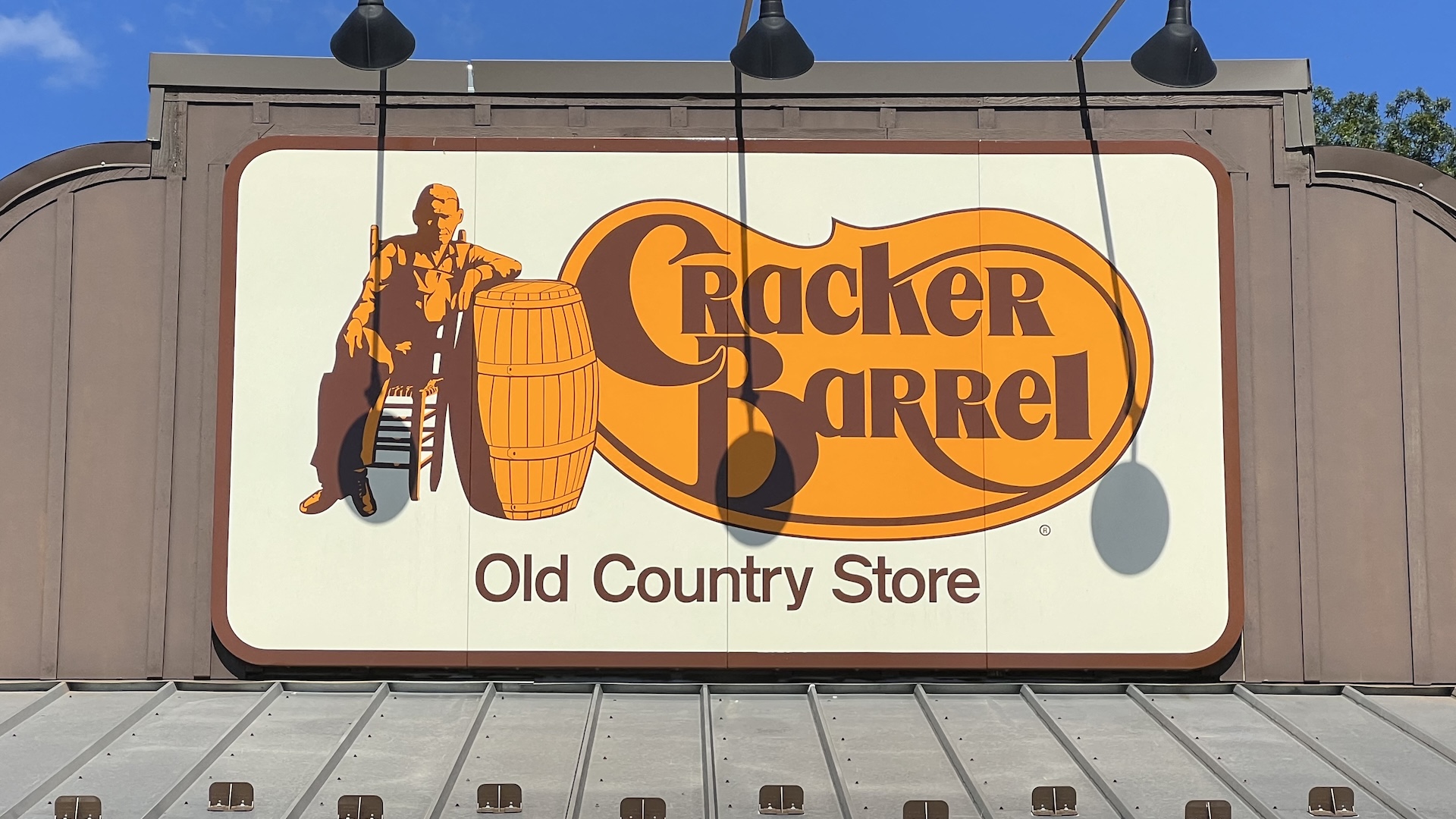
"If you haven't read about Cracker Barrel's rebrand kerfuffle yet, where have you been? Even mainstream news sites are picking up on the outpouring of disbelief over the logo's stripped back new appearance. Vintage Americana is no more, it seems, as the intricate logo has been replaced by a bland orange blob. And with Cracker Barrel already apologising, the brand is only too aware of the issue."
"Analytical notes on the original logo and official redesign explain what this designer wants to do in their own version (something we love reading about for all the best logos out there). These are a nice touch when assessing the reasoning behind the final design. Statements like "a callback to the original illustration would be nice" and "I prefer the warmer brown" and "I miss the border"."
""Nice work. You found a nice middle ground that still has some character, but is a much simpler design," said one fan. "Much better direction than the new," said another. But they did have one suggestion. "Haven't seen your exploration so I'm not sure if you've considered a couple things to experiment with. The barrel hoops look like old luggage straps at first glance. Have you explored using anythin"
Cracker Barrel implemented a stripped-back logo that replaced an intricate vintage illustration with a flat orange shape, prompting widespread disbelief and an apology from the brand. Mainstream news outlets and social platforms amplified reactions to the minimalist redesign. A Reddit designer posted an alternative rework that reintroduced a recognizable barrel form, warmer tones, and the original subtitle to aid consumer recognition. The designer provided analytical notes explaining choices such as calling back the original illustration, preferring warmer brown, and restoring the border. Community responses praised the rework as a balanced, character-retaining simplification, while offering suggestions about the barrel hoops resembling luggage straps.
Read at Creative Bloq
Unable to calculate read time
Collection
[
|
...
]