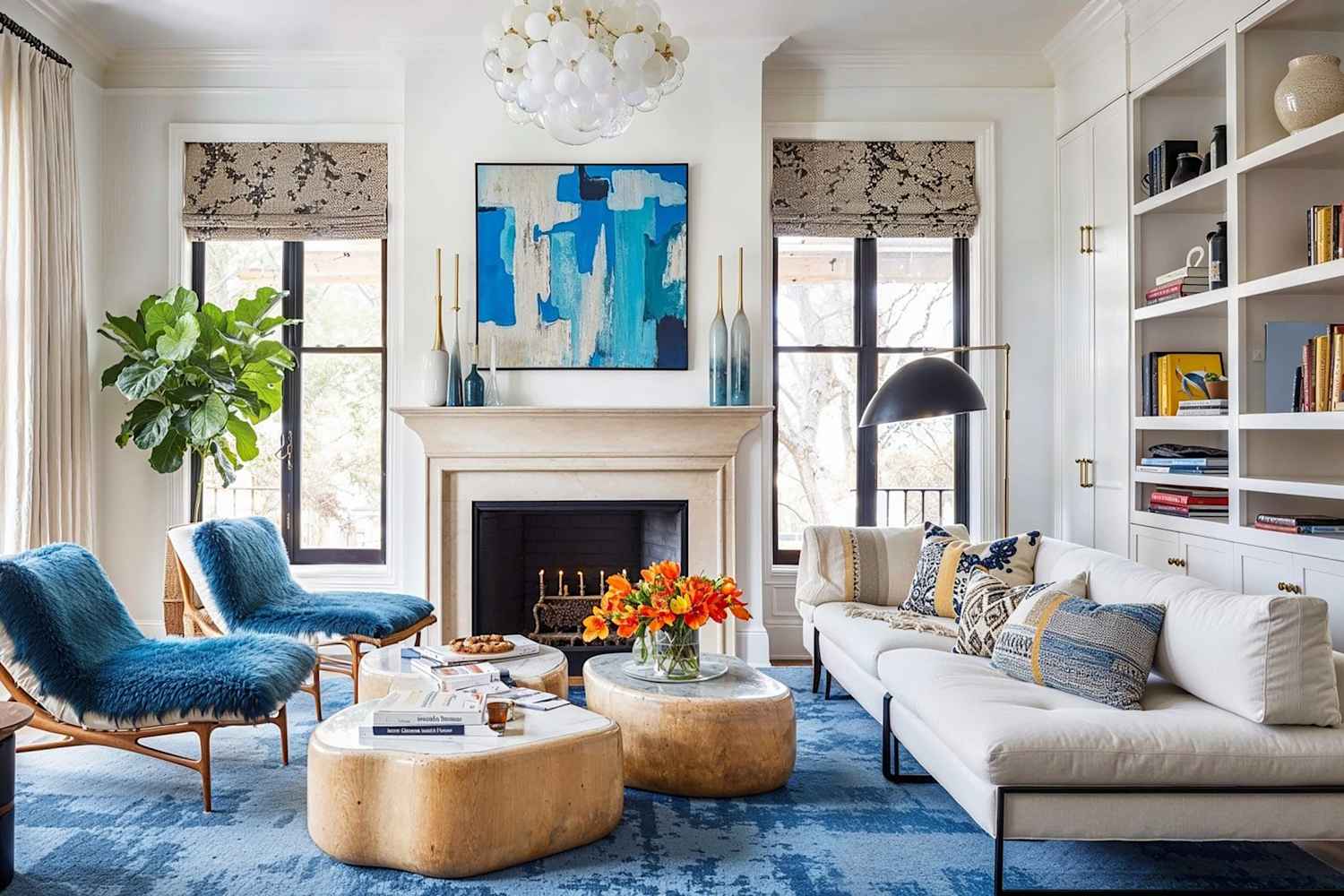
The 60-30-10 rule prescribes dividing a room's color palette into proportions: 60% dominant, 30% secondary, and 10% accent. The approach draws on proportional balance related to the Golden Section and uses contrast and emphasis to produce visual harmony. Designers apply the dominant color across walls or large furnishings, the secondary color to furniture or textiles, and the accent color to accessories, trim, or focal elements. When applied consistently, the ratio simplifies decision-making, ensures cohesion, and helps scale colors relative to a room's size and function. Custom color analysis can refine the palette by adjusting hue, saturation, and temperature to suit lighting and architecture. The rule offers an adaptable framework for bedrooms, living rooms, kitchens, and hospitality spaces.
"If you've ever struggled to put together the perfect color palette for a room, you're not alone. Choosing the colors is only half the battle; the real challenge starts as you begin integrating them into your space. Interior designers understand this dilemma all too well - and believe it or not, they have a secret formula they use to create perfectly balanced and cohesive spaces every time they redecorate."
"The 60-30-10 color theory rule is an idea based on the Golden Section, which is a mathematical, geometric approach to understanding balance and harmony in proportions of thirds, Readinger explains. It can often be observed in nature; for example, consider the expanding spiral of a seashell. "In terms of color, the idea is that roughly two-thirds of a space is comprised of one color, roughly one-third is a complementary color, and the last 10% is an offset," she adds."
Read at Apartment Therapy
Unable to calculate read time
Collection
[
|
...
]