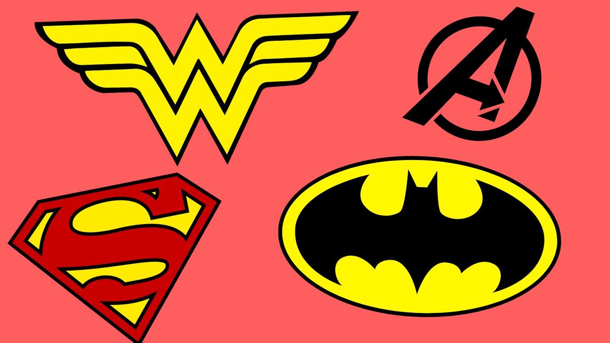
"Milton Glaser's 1980s redesign of Wonder Woman's logo transformed the character's identity by ingeniously merging an eagle motif with her initials, creating a memorable double-W."
"The essence of a great superhero logo lies in its simplicity, style, and the ability to relay the character's core qualities while ensuring broad recognition."
The article discusses the significance of superhero logos, highlighting their ability to become iconic symbols recognized globally. It emphasizes that a well-designed logo should be simple yet stylish and communicate the character's essence and tone effectively. The piece points to the evolution of various logos over time, particularly focusing on Wonder Woman's redesign by Milton Glaser in the 1980s, which transformed her identity. By merging traditional motifs with modern design principles, these logos not only serve as branding for superheroes but also resonate across diverse audiences, even those unfamiliar with comic books.
Read at Creative Bloq
Unable to calculate read time
Collection
[
|
...
]