""The space, she said, has a 'lightness' and 'calm' ideal for hearing lectures or talks or musical performances. 'It's a quite unique and meditative experience.'"},{"
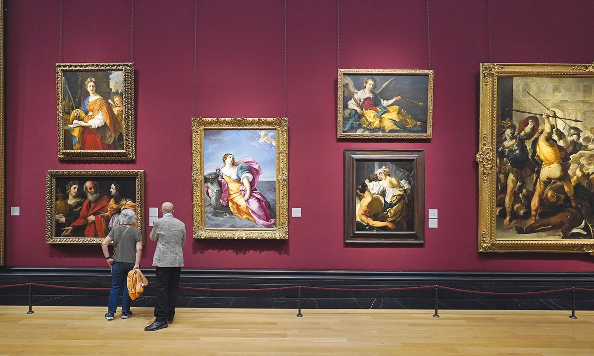
The article explores the influence of color in museum spaces, particularly through recent projects like Annabelle Selldorf's design for the Frick Collection's new auditorium. Selldorf's choice of muted grey, which invokes tranquility, contrasts with the vibrant red used in Tate Modern's Starr Cinema, representing the institution's dynamic essence. The discussion incorporates insights from Charlotte Klonk's work on museum interiors, showing how color choices affect visitor engagement and experiences in art spaces, leading to greater contemplation and appreciation of the artworks.
Read at Theartnewspaper
Unable to calculate read time
Collection
[
|
...
]