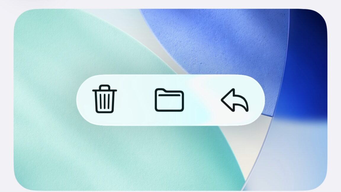
"Apple's new Liquid Glass user interface design was one of the most noticeable and divisive features of its major software updates this year. It added additional fluidity and translucency throughout iOS, iPadOS, macOS, and Apple's other operating systems, and as we noted in our reviews, the default settings weren't always great for readability. The upcoming 26.1 update for all of those OSes is taking a step toward addressing some of the complaints, though not by changing things about the default look of Liquid Glass."
"Rather, the update is adding a new toggle that will let users choose between a Clear and Tinted look for Liquid Glass, with Clear representing the default look and Tinted cranking up the opacity and contrast. The new toggle adds a half-step in between the default visual settings and the "reduce transparency" setting, which aside from changing a bunch of other things about the look and feel of the operating system is buried further down inside the Accessibility options."
Liquid Glass is a user interface design that adds fluidity and translucency across iOS, iPadOS, macOS, and other Apple operating systems. The default Liquid Glass settings reduced readability for some users because of low contrast and high translucency. The forthcoming 26.1 update introduces a Clear versus Tinted toggle, with Clear as the default and Tinted increasing opacity and contrast. The Tinted option preserves the layered appearance by keeping colors and vague shapes visible beneath glass panes while improving visibility. The new toggle provides an intermediate choice between the default visuals and the Accessibility "reduce transparency" setting, which is a more all-or-nothing change located deeper in Accessibility options.
Read at Ars Technica
Unable to calculate read time
Collection
[
|
...
]