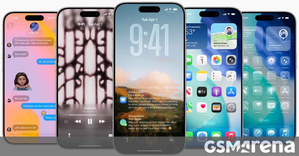
"iOS 26 launched last month with a huge redesign and the Liquid Glass UI, which has seen mixed reviews. While it is undoubtedly fresher-looking than iOS' previous UI, it's also definitely giving Windows Vista. Oh, and some people find that it has way too much transparency, which can impede usability. Apple has toned down the transparency since the first iOS 26 beta came out, so it's less in the final release than the company was initially planning."
"In the latest beta of this release, which went out today, there's a toggle that lets you control how much transparency you want in your life. It's not a slider, you only get to pick between two options. One is labeled "Clear", and this is the default setting we all know and love (or not), while the other option is "Tinted". This basically increases the opacity of the otherwise transparent elements, and adds more contrast."
iOS 26 introduced a major redesign with a Liquid Glass UI that many users find visually fresh but overly transparent, which can hinder usability. Apple reduced transparency from the earliest betas to the final iOS 26 release, and the iOS 26.1 beta now adds a user control for transparency. The new control offers two options, Clear and Tinted, where Tinted increases opacity and contrast. The toggle appears in Settings > Display and Brightness and is present in iOS, iPadOS betas, and macOS Tahoe 26.1 ahead of wider release.
Read at GSMArena.com
Unable to calculate read time
Collection
[
|
...
]