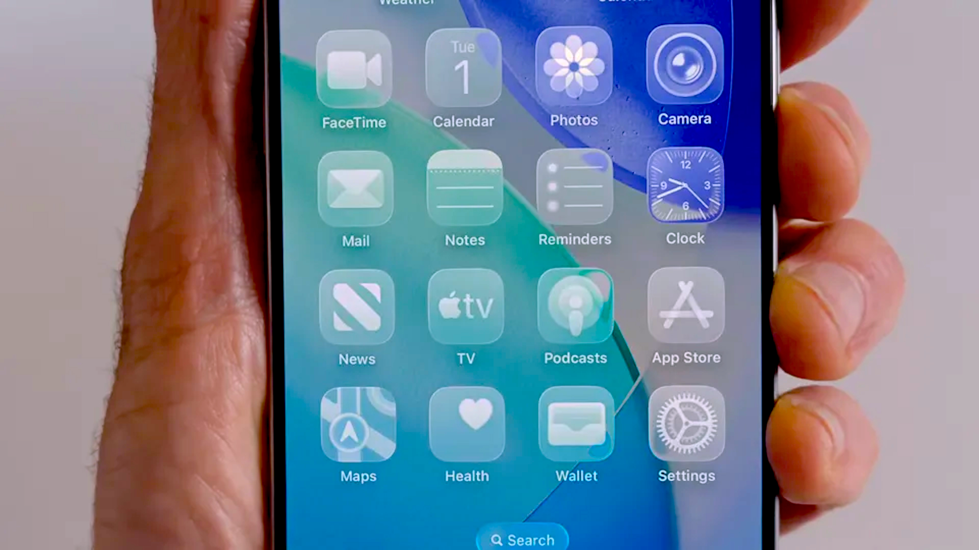
"It turns out more than a few users are experiencing a phenomenon whereby their home screen icons appear to be slanted on iOS 26. It's a subtle effect, but, seeing as your home screen is something you look at everyday, a noticeable one - and it seems to be seriously triggering the perfectionist in some users. Because what use is the best iPhone for photography if its icons aren't perfectly straight?"
"But it's all an illusion - it turns out the effect is being caused by the shimmering borders Apple has added to icons in order to create a subtle parallax effect when moving the phone. The effect is most noticeable against a dark background. And Reddit is full of users asking if they're seeing things. "I hadn't noticed it at the first glance, but now I can't unsee the tilted app icons," one user comments,"
The iPhone launch paired bold new designs with a hardware controversy over surface scratches. Some users on iOS 26 perceive home screen icons as slightly slanted, an optical effect that stands out against dark wallpapers. The apparent tilt arises from shimmering borders applied to icons, which create a subtle parallax motion when the device moves. Several users describe icons as crooked or falling over, causing frustration for perfection-oriented users. Enabling Reduce Motion in Accessibility disables the parallax shimmer and restores straight-looking icons. The software workaround fixes the illusion, while physical scratches require hardware or protective solutions.
Read at Creative Bloq
Unable to calculate read time
Collection
[
|
...
]