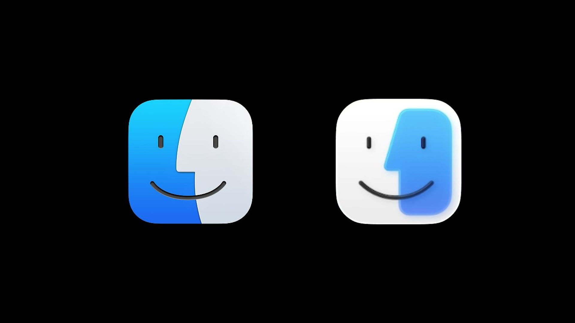
"All the Liquid Glass/Vista jokes aside, if Apple keeps this Finder icon, I'm going to riot! (Photo via Stephen Hackett) pic.twitter.com/mpt0PxcGaj June 10, 2025"
"Apple's new Liquid Glass UI is terrible. Not only is it ugly, but also a usability nightmare. Then on top of that they destroyed the beautiful Finder icon we all loved. It truly is a sad day. Apple designs used to be so solid, what happened? June 11, 2025"
Apple's recent update to the Finder icon in macOS Tahoe has sparked significant dissatisfaction among users. The classic blue and white color scheme has been modified, alongside the introduction of a new Liquid Glass texture. Traditionally, the Finder icon has maintained its design since 1996 and is inspired by various cultural elements. This alteration defies Apple’s usual adherence to iconic brand elements. While the rationale for the change remains unclear, the backlash on social media suggests many users find the redesign an unwelcome departure from Apple’s design heritage.
Read at Creative Bloq
Unable to calculate read time
Collection
[
|
...
]