#UX
#UX
[ follow ]
#web-design #design #accessibility #ui-design #seo #ai #ai-design-tools #prototyping #product-design #web-development


fromMedium
6 days agoHow reading patterns have changed
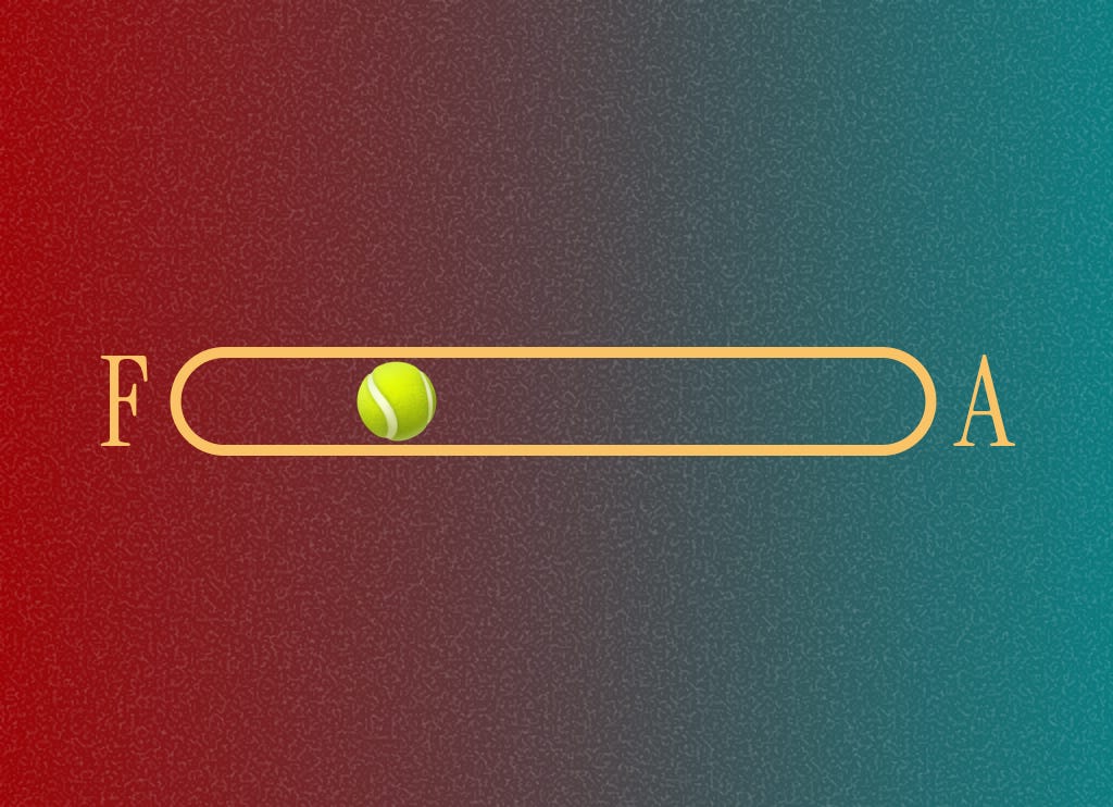
I want to revisit the age old question about "button placement", to see how UX may have shifted, and how the technology we have now may have changed the way we consume content. And how that, in turn, impacts how buttons and UI elements are placed. If we read from left to right, where should the primary button go: left or right?
UX design


fromMedium
1 month agoNew navigation paradigms, ChatGPT talks too much, AI coding tools
To navigate is to read the world in order to move through it, whether it means scanning a crowd to find a familiar face, deciphering the logic of a bookstore's layout, or following the stars at sea. This ability has always been mediated by tools (many of them disruptive and transformative). Still, the rise of artificial intelligence presents us with a radical promise: a world where we no longer need maps, because the information or the product 'comes to us.'
UX design
Web development
fromSitePoint Forums | Web Development & Design Community
1 month agoBest UX Practices for Designing Financial Calculators Online?
Use lightweight, accessible client-side calculators with progressive enhancement, careful localization, single-domain SEO focus, and optimized scripts to maximize performance and engagement.
Web development
fromVue.js Jobs
1 month agoScayle Senior Frontend Engineer M F D Scayle Storefront Hamburg or Berlin Hybrid - VueJobs
Senior Frontend Engineer role to build high-traffic Vue+TypeScript storefronts, shape architecture, and improve UX and team processes at a fast-growing eCommerce company.
UX design
fromLogRocket Blog
2 months agoPrompt engineering vs. prompt design: The UX perspective on AI personality - LogRocket Blog
Generative AI agent personality and prompt design shape user experience and require UX designers to craft distinctive, user-aligned tones alongside technical prompt engineering.
fromMedium
4 months agoThe Psychology Of Trust In A World Where Products Keep Breaking Promises
Have you ever been a part of a product launch that felt more like a daunting experience, rather than an exciting or thrilling one? The product launch where users got more confused and felt helpless? Where they could not even point out what was wrong, because the product team worked so heavily on improving the tech and the UX, that it actually changed the way they were used to working before.
UX design


fromMedium
3 months agoI Tested 5 AI Tools on 10 Real UI Design Prompts-Here's What Actually Works in 2025
AI design tools are everywhere right now. But here's the question every designer is asking: Do they actually solve real UI problems - or just generate pretty mockups? To find out, I ran a simple experiment with one rule: no cherry-picking, no reruns - just raw, first-attempt results. I fed 10 common UI design prompts - from accessibility and error handling to minimalist layouts - into 5 different AI tools. The goal? To see which AI came closest to solving real design challenges, unfiltered.
UX design
fromMedium
3 months agoInterview with Lan Johnson, Senior Designer at Square
I actually started out thinking I wanted to be a graphic designer. I was really into anime as a kid, and when I got my hands on a (very outdated and pirated) copy of Photoshop 6 at around age 11, I was hooked. In high school, I also taught myself how to code, which opened the door to doing small freelance jobs here and there while I was still in school.
UX design
fromMedium
4 months agoHero Images are Dead. These Solutions are Replacing Them.
The thing is, the company I was working for had a dedicated photo team that provided beautiful, high-quality images with numerous contextual and action shots, perfect for web pages. So when what came to my desk was a classic full-page hero of an image with a gradient, I wasn't exactly surprised. But it did frustrate me that we couldn't come up with something more bold.
UX design
#design

Graphic design
fromuxdesign.cc
9 months agoWhere design finds (and loses) its soul
The essence of design is transforming abstract concepts into tangible visual artifacts.
Many current design crises stem from poorly informed content creators.
A generation of designers is misled by superficial teaching and mediocrity.
The proliferation of design courses and mentorships complicates the understanding of real strategic design.
[ Load more ]