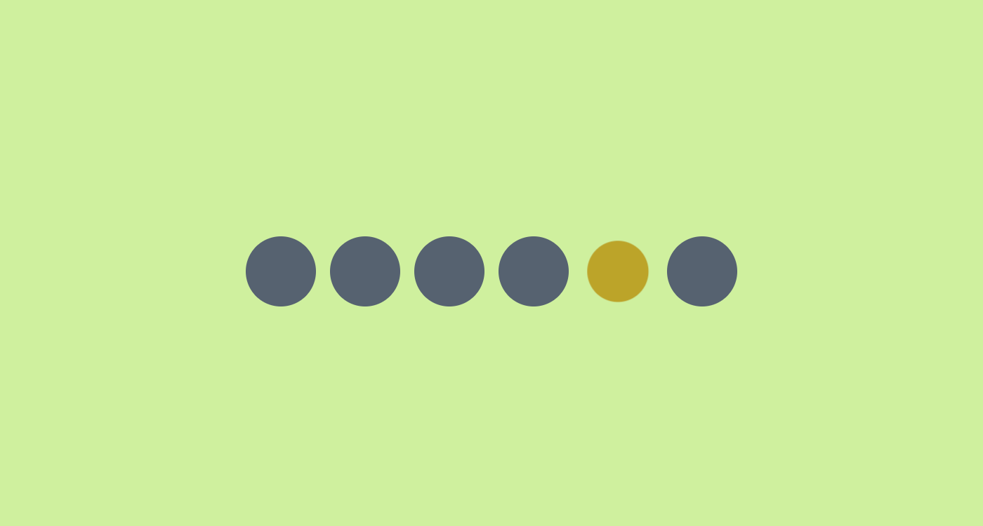
"Let's suppose you have N elements with the same animation that should animate sequentially. The first one, then the second one, and so on until we reach the last one, then we loop back to the beginning. I am sure you know what I am talking about, and you also know that it's tricky to get such an effect. You need to define complex keyframes, calculate delays, make it work for a specific number of items, etc. Tell you what: with modern CSS, we can easily achieve this using a few lines of code, and it works for any number of items!"
"The following demo is currently limited to Chrome and Edge, but will work in other browsers as the sibling-index() and sibling-count() functions gain broader support. You can track Firefox support in Ticket #1953973 and WebKit's position in Issue #471. In the above demo, the elements are animated sequentially and the keyframes are as simple as a single to frame changing an element's background color and scale: @keyframes x { to { background: #F8CA00; scale: .8; } }"
"You can add or remove as many items as you want and everything will keep running smoothly. Cool, right? That effect is made possible with this strange and complex-looking code: .container > * { --_s: calc(100%*(sibling-index() - 1)/sibling-count()); --_e: calc(100%*(sibling-index())/sibling-count()); animation: x calc(var(--d)*sibling-count()) infinite linear(0, 0 var(--_s), 1, 0 var(--_e), 0); } It's a bit scary and unreadable, but I will dissect it with you to understand the logic behind it."
Modern CSS can produce sequential, looping animations for any number of sibling elements by using sibling-index() and sibling-count() to compute per-element start and end percentages. The linear() timing function supports piecewise control points that allow each element to occupy a specific segment of the animation timeline. A minimal keyframe (for example changing background and scale) can animate each element in turn. The technique calculates --_s and --_e from sibling-index()/sibling-count(), then applies animation: x calc(var(--d)*sibling-count()) infinite linear(0, 0 var(--_s), 1, 0 var(--_e), 0) to stagger elements without manual delays. Current support is strongest in Chromium-based browsers.
Read at CSS-Tricks
Unable to calculate read time
Collection
[
|
...
]