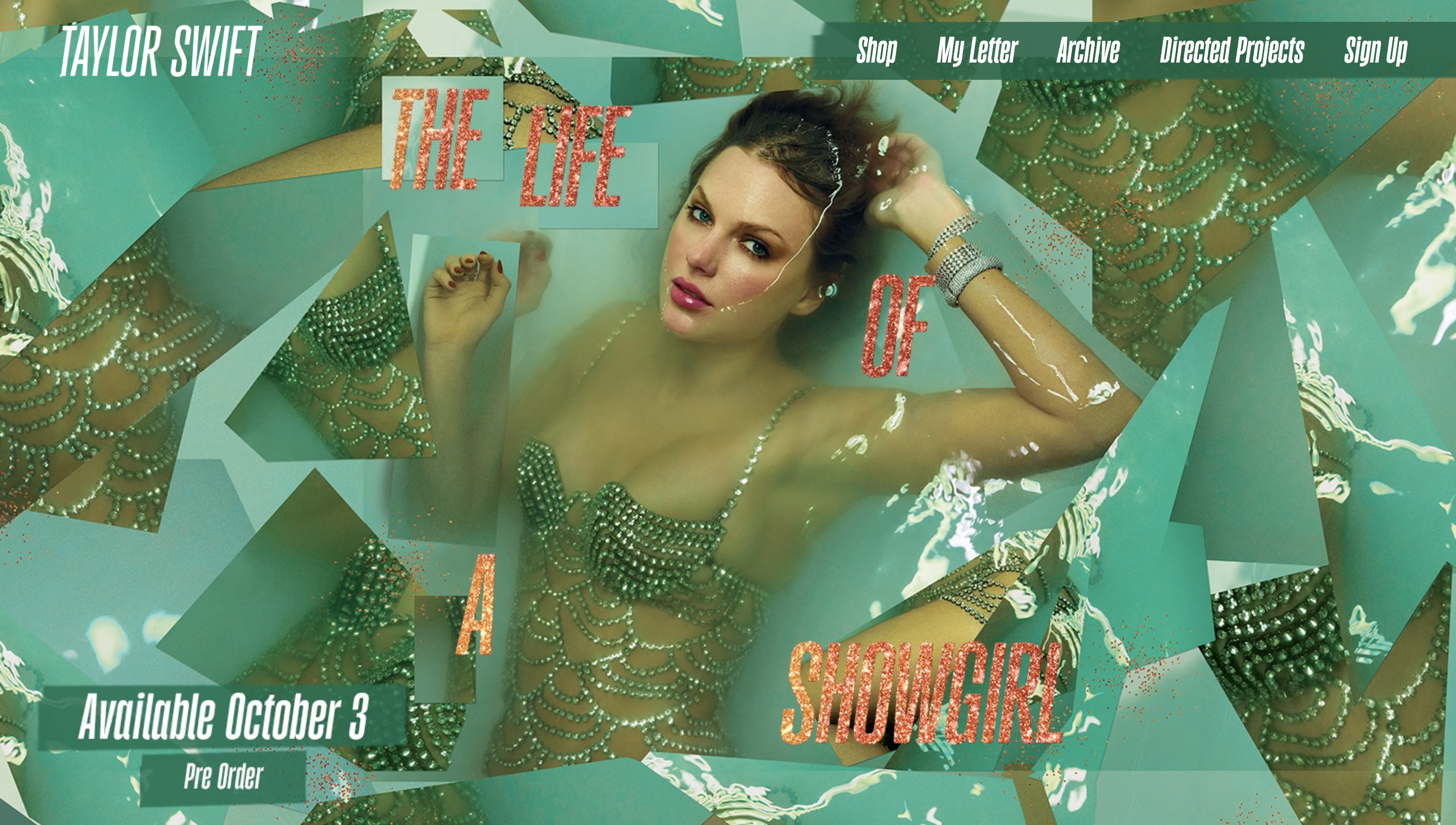
"While orange and green might make a fetching palette, it spells bad news for accessibility, meaning there's much to be learned from Ms Swift's design flaw. You can employ the best designers or opt for the best website builder, but without accessibility at the forefront of your design, you risk alienating a huge audience. By today's standards, aesthetics and accessibility need to work in tandem, and sadly, Taylor's website misses the mark."
""Taylor Swift's latest website is an example of how accessibility is overlooked in digital design. Low colour contrast, tiny fonts, missing alt text and broken HTML all create barriers that exclude people and limit independence," Lauren tells Creative Bloq. "Accessibility isn't a Helpdesk issue to be fixed later. It has to be baked in from the start, starting with branding and carried through every stage of website design and development," she adds."
Brand and web designer Lauren Sherrard identified multiple accessibility issues in Taylor Swift's website revamp. The orange-and-green palette sits close on the colour wheel and is almost indistinguishable for people with colour blindness. Design choices include glittery, flowing motion, tiny unreadable fonts and all-caps text that complicate content processing for some users. The site also exhibits low colour contrast, missing alt text and broken HTML that create practical barriers and limit independence. Accessibility should be integrated from branding through development, with functionality treated as a baseline rather than a later fix.
Read at Creative Bloq
Unable to calculate read time
Collection
[
|
...
]