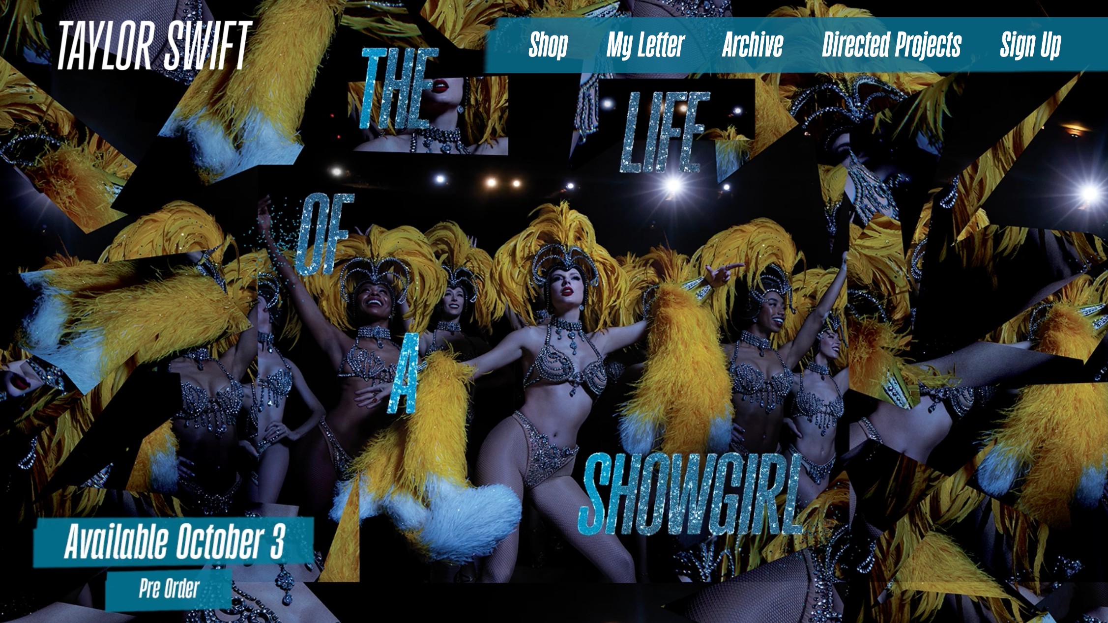
Taylor Swift's latest website contains numerous accessibility issues that hinder inclusion. Orangey-red text on a green glittering background created colour-contrast problems for people with colour blindness. Drop shadows, tiny font sizes and a narrow typeface reduce legibility and blur letters together. All-caps text makes reading difficult for people with dyslexia and can be spelled out letter-by-letter by screen readers. Glittering visual effects can trigger uncomfortable afterimages or pain for users with certain visual conditions. Missing alt text and incorrect labeling prevent effective navigation for screen reader users and exclude disabled fans from full participation.
"I never thought I'd write a piece criticising Taylor Swift. I've been a devoted fan since becoming enraptured by her Eras Tour movie. And while my musical tastes normally veer towards post-rock, punk and metal, her pandemic opuses Evermore and Folklore reached parts of my heart I never knew pop could touch. So I genuinely believed Taylor could do no wrong. But unfortunately, her latest website is a masterclass in how not to design for inclusion."
"All-caps text might look dramatic, but it's difficult for people with dyslexia to process, and screen readers often spell it out letter by letter (imagine hearing "T-A-Y-L-O-R-S-W-I-F-T" instead of her name). And those glittering effects don't just make text harder to read; for people with certain visual conditions, they can cause uncomfortable afterimages, or make the page literally painful to look at."
Read at Creative Bloq
Unable to calculate read time
Collection
[
|
...
]