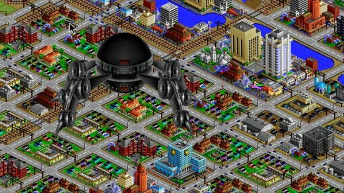
"Speaking of seductive simplicity, the retro-futurism of SimCity 2000's look and feel is still compelling after all this time. As a child, I remember being immediately put off by the look of the original SimCity, with its garish EGA colors, complicated user interface, and overly rigid, stylized overhead grid map. By contrast, the bright SVGA colors, angular hills, flowing waterfalls, and isometric skyscrapers of SimCity 2000 felt, at the time, like the future implied by its title."
"Now that the year 2000 is a quarter-century in the past, there are definitely some UI touches that feel downright archaic, though. Years of quickly dragging and zooming through the likes of Google Maps and smartphone photos makes it feel incredibly awkward to use the much rougher camera tools in SimCity 2000. I found myself constantly wishing for the ability to turn the camera in increments less than 90 degrees or to have access to a more fine-grained zoom control."
SimCity 2000 presents a retro-futuristic aesthetic with bright SVGA colors, angular terrain, waterfalls, and isometric skyscrapers that felt like the future. The original SimCity used garish EGA colors and a rigid overhead grid that many found off-putting. Modern expectations from Google Maps and smartphone image tools make SimCity 2000's camera controls and 90-degree rotation limits feel awkward and dated. The game retains charm through small pixel-art buildings served by electricity, water, and nearby services. Players oscillate between wanting to responsibly build livable spaces for citizens and indulging impulses like unleashing a virtual tornado. A DOSBox-powered Special Edition with Urban Renewal Kit is available on GOG.
Read at Ars Technica
Unable to calculate read time
Collection
[
|
...
]