"When you put Apple Music and Spotify side by side, you realize how two products serving the same purpose can feel completely different. Both are leaders in their space, both have years of design evolution behind them, yet their choices say a lot about design philosophy, brand personality, and user behavior. Let's break down how these two approach their core screens and interactions and what we can take away from them."
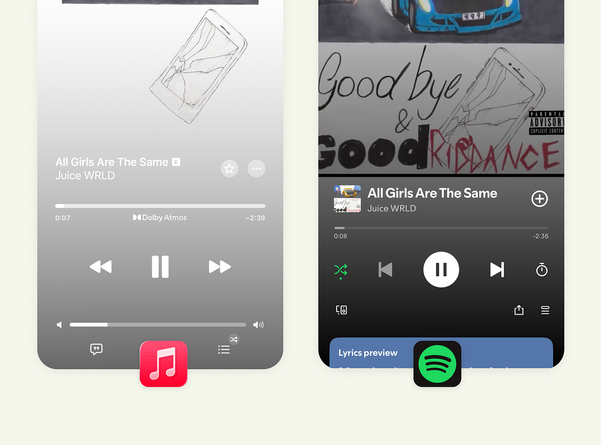
"Apple Music takes a calm, minimalist route. The interface feels almost meditative, spacious, centered, and distraction-free. But that visual stillness has trade-offs. The volume and track sliders look nearly identical, which could confuse new users. And given that most people adjust volume with physical buttons, that second slider arguably adds clutter. Spotify, in contrast, embraces structure. You see controls, states, and feedback clearly."
"Apple's lyric experience feels cinematic. Only the current line is highlighted, and the rest fades away softly. The typography is large and expressive, guiding attention exactly where it should be. It's less about singing along and more about immersion. Spotify's lyric UI is more inclusive; it shows more lines at once so users can follow, anticipate, and join in. The trade-off? Slightly reduced focus. The smaller type and dense layout work for engagement but not necessarily for deep reading."
Apple Music favors a calm, minimalist main player that feels meditative and distraction-free, though similar-looking volume and track sliders can confuse new users and add clutter. Spotify emphasizes structured, high-contrast controls that surface states and feedback for clearer usability, especially in dark mode. Apple's lyrics view highlights a single line with large expressive type to create immersion, while Spotify shows more lines to support following and singing along, prioritizing engagement. Queue handling differs by placement and accessibility, illustrating trade-offs between serenity and control that align with different listening intentions and user behaviors.
Read at Medium
Unable to calculate read time
Collection
[
|
...
]