"Links should remain clearly recognizable without being overly styled. A combination of brand colors and subtle underlines can create a balanced appearance."
"Adjusting underline opacity and position can enhance link readability. Using currentColor streamlines the styling process, adapting to different design choices effortlessly."
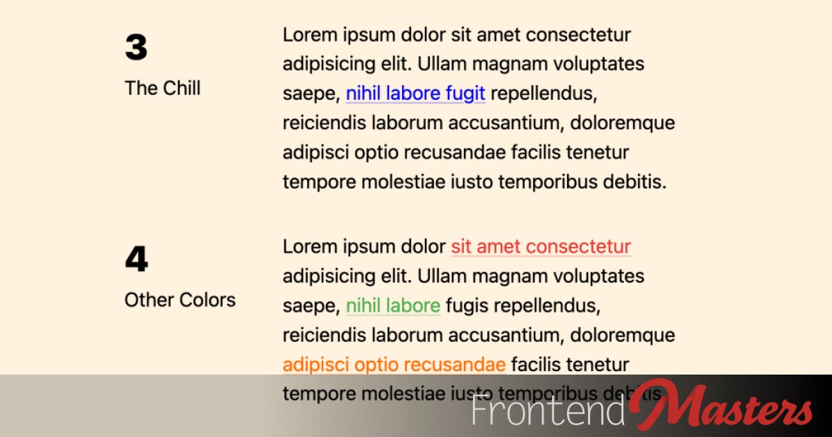
"A relaxed link design maintains user familiarity while improving aesthetic comfort. Underlines can be subtly adjusted to improve legibility without detracting from text."
"Consider using CSS properties like text-decoration-color and color-mix() to create visually appealing links that avoid intense default styles."
This article discusses the design of hyperlinks within body text, emphasizing a balance between visibility and distraction. It advocates for blue, underlined links as a default but also suggests flexible use of brand colors. Recommendations include adjusting underline opacity and positioning for enhanced legibility. The article also explores using CSS properties like currentColor and color-mix() for responsive styling, ultimately aiming for a less intense appearance that remains accessible and user-friendly in various contexts.
Read at Frontendmasters
Unable to calculate read time
Collection
[
|
...
]