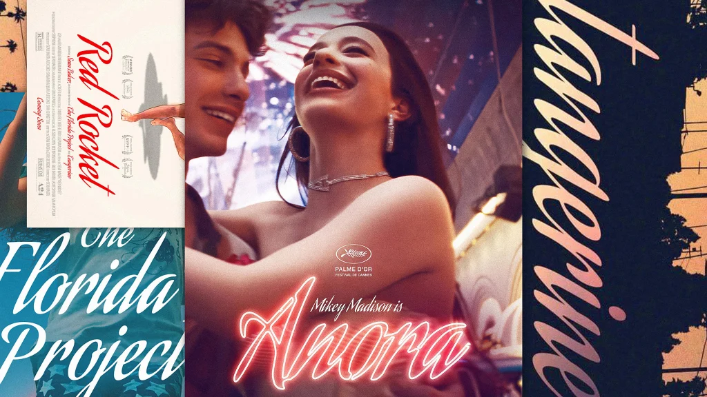
"Baker told the streaming platform Mubi last year that he first selected Aguafina Script for the title sequence of 2015's Tangerine, about a transgender sex worker (a film that was shot entirely on iPhones), because he was looking for something that was "stylistically interesting" and because it subverted the grittiness of the subject matter. "It is saying that there is an elegance to this production in the way we're presenting the subject matter," he said."
"After realizing the font could serve the same purpose for 2017's The Florida Project (about a girl and her single mother who live in a motel near Disney World), he said, "If I continue this it could eventually become something that people connect with-and connect with my films [the way Carpenter's and Allen's fonts did with theirs].""
"For director Sean Baker, whose comedy-drama Anora won the 2025 Oscar for Best Picture and netted him the Academy Award for Best Director, his font of choice is the tall, narrow, decorative Aguafina Script."
The article explores the concept of fonts as a signature style for filmmakers, highlighting how certain typefaces become synonymous with their work. Focused on Sean Baker, it details his choice of Aguafina Script, a typeface known for its semi-formal, eye-catching qualities. Baker first used the font in 'Tangerine' to create an elegant presentation contrasting with gritty content. He continued its use in 'The Florida Project,' aiming for it to become a recognizable part of his filmmaking identity, similar to how other directors have established their own font signatures.
Read at Fast Company
Unable to calculate read time
Collection
[
|
...
]