"Stuffed with a barrage of road signs, artful modernist chairs and all the tools of her trade, Margaret Calvert's studio occupies the ground floor of her trim terrace house in Islington, London. She still draws by hand, using coloured pencils, ink pens and gouaches, echoes of a simpler time when there were neither computers nor gazillions of Pantone colour options."
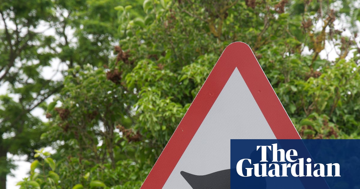
"Only a handful of graphic designers have had a typeface named after them. One of the earliest was the 18th-century Italian Giambattista Bodoni, whose fonts have conferred on him a kind of immortality. But his efforts were not to everyone's taste: William Morris was said to have loathed Bodoni's letters, grumpily raging at their sweltering hideousness. The animal in her cattle sign was based on a real cow named Patience Like Bodoni, Calvert has been inducted into the graphic equivalent of Mount Olympus."
"Designed in 1971 for the French new town of Saint-Quentin-en-Yvelines, but rejected for being too English, Calvert is a contemporary version of a slab serif. (Serif refers to letters with strokes abutting their ends you're reading one now). These bold, attention-grabbing typefaces date from the 19th century. Calvert has been described as having vitality and elegance, avoiding the stiff and mechanical."
Margaret Calvert's studio in Islington houses road signs, modernist chairs and traditional drawing tools such as coloured pencils, ink pens and gouaches. Calvert continues to draw by hand, reflecting an era before computers and extensive Pantone choices. Graphic design was once called commercial art, and only a few designers have typefaces named after them, including Giambattista Bodoni. Bodoni's fonts provoked strong reactions from figures like William Morris. Calvert's work includes a cattle sign based on a real cow named Patience and the Calvert typeface used on the Tyne and Wear Metro. Her black M on yellow has become a civic landmark across the north-east.
Read at www.theguardian.com
Unable to calculate read time
Collection
[
|
...
]