"The award-winning typeface spells out the album's name and tracklist across multiple variants. Moreira, a heavy metal fan, tells Fast Company that he found out Swift was using his font after a Swiftie friend told him. "At first, I couldn't believe it, but then I confirmed it really was Gazzetta," he says in an email. "It has been an incredible surprise to see a typeface I designed connected to such a huge cultural moment; it's surreal but deeply rewarding.""
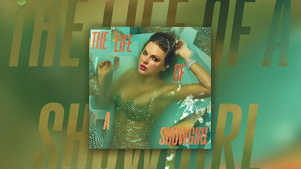
"Swift switches things up between eras, choosing type styles from Blackletter font for Reputation to marker handwriting for 1989 in order to best suit the mood of each album. For The Life of a Showgirl, with her Las Vegas showgirl-style wardrobe for the album photo shoot and the jagged collage-style treatment for the album art, Swift is using a font that's loud. In all-capital letters, the album title is rendered in tabloid headline style, and the letters are filled in with glitter."
Gazzetta is a tall, condensed sans-serif type family designed by Nicaraguan type designer Edwin Moreira and published by TipoType in 2022. The typeface is being used to render The Life of a Showgirl album title and tracklist across multiple variants, including an all-caps tabloid-headline style with glitter-filled letters that complements Las Vegas showgirl visuals and collage-style album art. Moreira learned of the font's use after a Swiftie friend alerted him and described the connection to a major cultural moment as surreal and deeply rewarding. Gazzetta’s Neo-grotesque letterforms suit posters, covers, magazines, and large-format materials.
Read at Fast Company
Unable to calculate read time
Collection
[
|
...
]