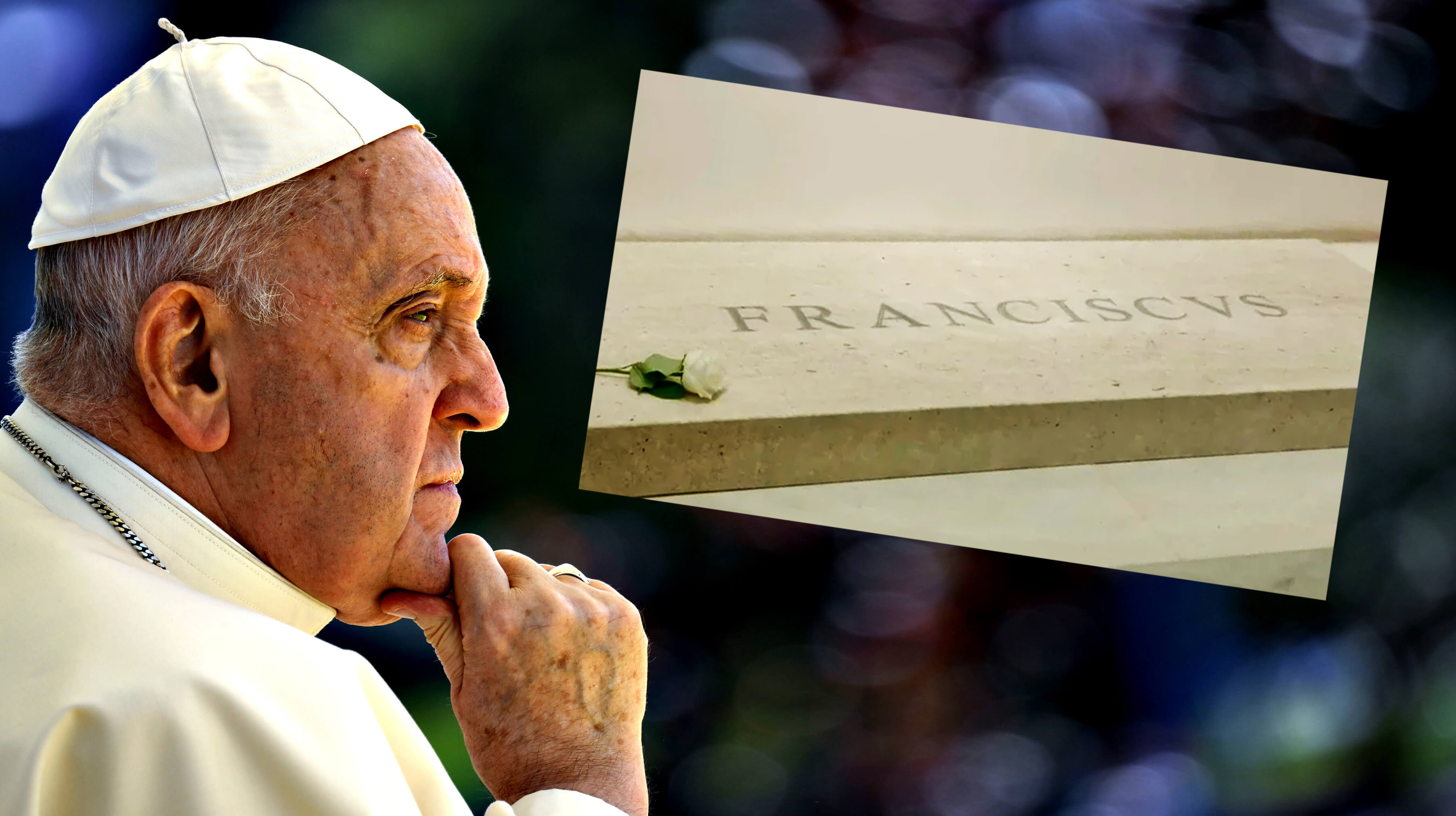
""Seriously, I find this kinda stuff so strange, especially on such a high-profile job. This'll be one of the most important engravings of the decade and they let someone f**k it up.""
""No, there is no historical or aesthetic reason why the kerning is so poor," Christopher Calderhead, editor and designer of Letter Arts Review tells Fast Company."
The poor kerning on Pope Francis's tomb has sparked outrage among designers, as the spacing issues create an unprofessional appearance. Observers on Reddit and X are questioning how such a noticeable mistake could occur on such an important engraving. Experts have dismissed claims that the irregular spacing was deliberate or justified historically. The overall consensus is that the kerning error reflects a lack of attention to detail in a high-profile design project, emphasizing the serious implications of typography in public monuments.
Read at Creative Bloq
Unable to calculate read time
Collection
[
|
...
]