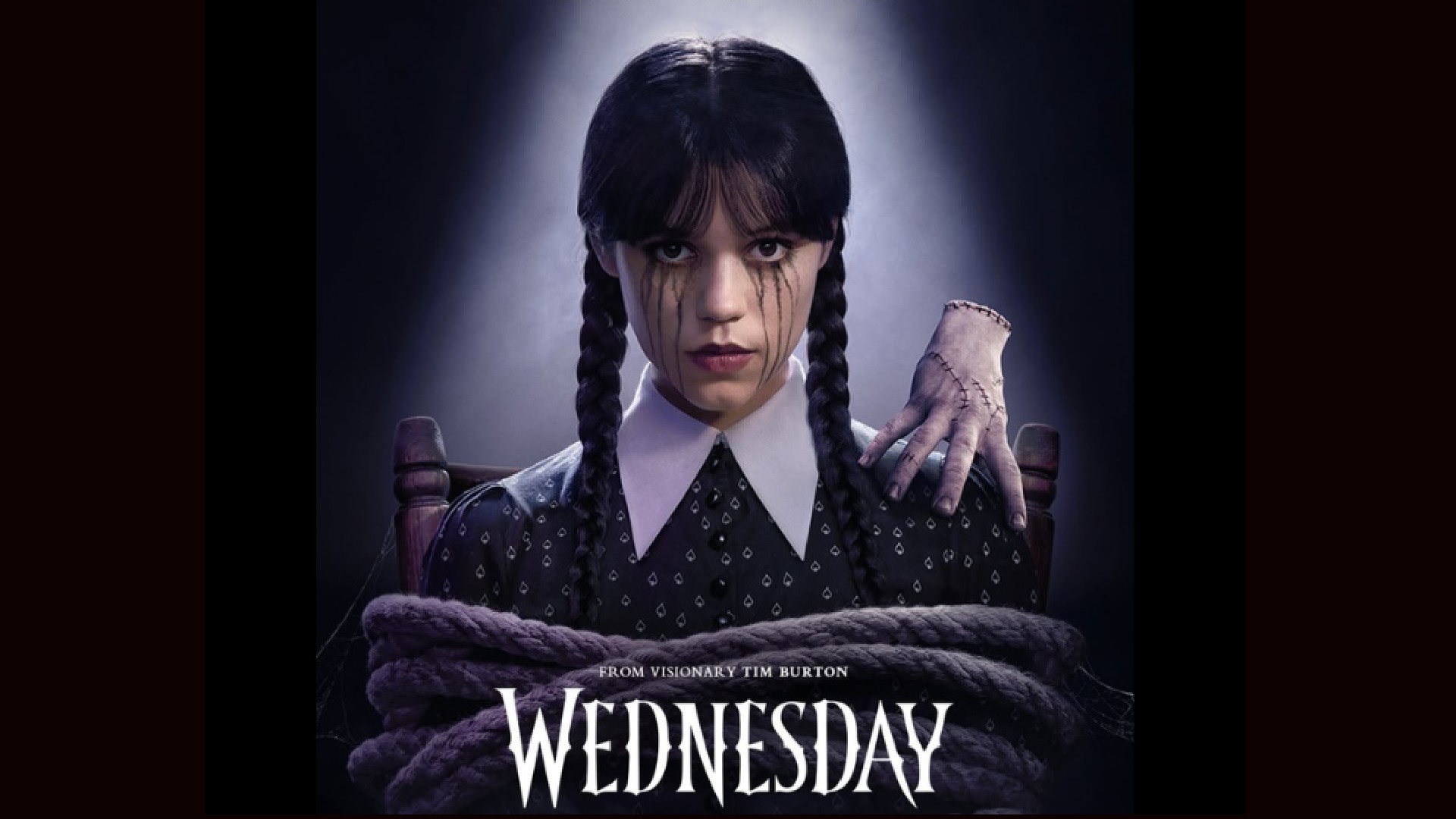
"The bespoke typography is not just visually striking; it reflects Wednesday's razor-sharp wit and the delicate balance between elegance and danger inherent to her character."
"The series captures the essence of the Addams Family daughter, portraying her journey through Nevermore Academy with meticulously crafted visuals and an intricate interplay of lighting."
Wednesday, directed by Tim Burton, follows the Addams Family daughter at Nevermore Academy. The series is visually stunning, showcasing neo-Gothic architecture and intricate lighting. The contrast between warm and cold tones adds depth to character moments. A standout element is the custom typography, designed to reflect Wednesday's personality. The bespoke font is not merely decorative; it serves to convey her wit and the tension between elegance and danger, enhancing the branding of the series effectively.
Read at Creative Bloq
Unable to calculate read time
Collection
[
|
...
]