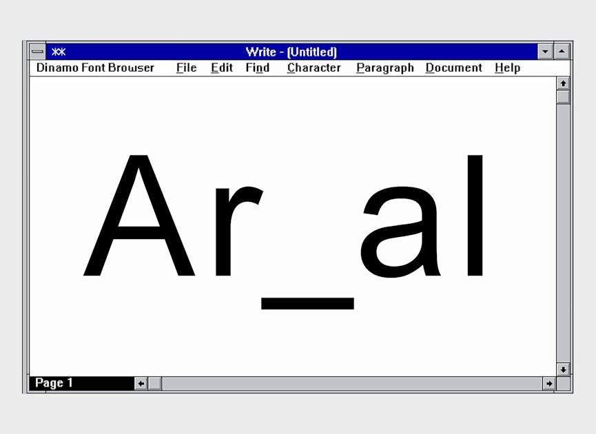
Areal is a revival of Arial, entirely redrawn and rebuilt by Dinamo specifically for Are.na. Dinamo designed the revival to suit Are.na's interface and editorial needs. Johannes and the Dinamo team collaborated with Are.na after initial meetings that began in 2019 and continued over years. Are.na retained Arial across a front-end rewrite, motivating a custom solution rather than a departure from the familiar type. The project combined technical type design, platform-specific optimization, and shared design sensibilities. The result aims to preserve Arial's functional qualities while refining letterforms for better integration and expression on the site.
"Over the past year, we've been working with the design studio Dinamo on a custom typeface for Are.na. Starting today, the typeface you'll see on Are.na (and that you're reading right now on Are.na Editorial) is Areal, a "revival" of Arial, entirely redrawn and rebuilt from the ground up. We're excited about Areal because Dinamo's revival is designed to be especially suited for Are.na."
"Charles Broskoski: Yeah, Johannes and I met in 2019 at a conference called Post Design Festival. We chatted every once and a while, but the next time we saw each other was probably five years later when Johannes came to New York. We had the idea that we wanted Are.na and Dinamo to do something together, but it wasn't quite clear what it should be."
Read at Are.na
Unable to calculate read time
Collection
[
|
...
]