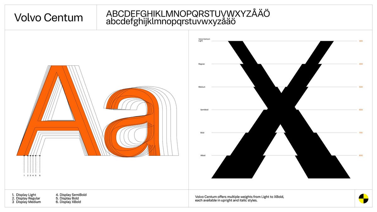
"Volvo on how they studied how drivers responded to different fonts. I was surprised that the video only got around 70k views, and I think this is very interesting given how often small design decisions, such as typography, are overlooked."
"Since the beginning of my UX Design journey, I was always taught about making designs "usable", "engaging", "having a clear value proposition for shareholders", and "measuring impact". All of those metrics are typically associated with designing engaging interfaces that deliver value by reducing errors and friction points. But all of those things ultimately tie to metrics of engagement."
"All of those metrics are typically associated with designing engaging interfaces that deliver value by reducing errors and friction points. But all of those things ultimately tie to metrics of engagement."
"But seeing a car manufacturer treat a font like a piece of safety hardware changes how I look at my own work."
Volvo studied how drivers respond to different fonts to understand how typography can affect safety. Font choices influence how quickly and accurately drivers perceive information while driving. Typography can reduce errors and friction by improving clarity and recognition. Designing for attention and inattention connects usability and engagement to measurable outcomes like fewer mistakes. The work reframes typography as safety hardware rather than a purely aesthetic decision. It also emphasizes that small design details can meaningfully change driver behavior and performance in real-world conditions.
Read at Medium
Unable to calculate read time
Collection
[
|
...
]