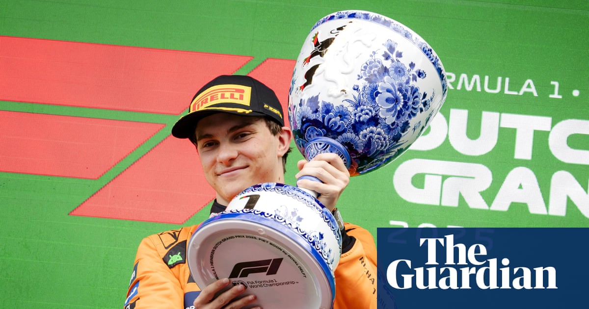
"But their form is mostly irrelevant to their function. In order to signify your tournament as more important than other tournaments, the trophy needs to be more spectacular in some way. So the tendency is to make them either bigger or more garish. They need to look valuable without actually being valuable, or the winners wouldn't want to give it to the next winners."
"Maybe because the designers got it so right so quickly, with the classic trophy design. Like the FA Cup. So any attempt to diverge ends up looking trashy, gimmicky and a bit needy. As someone else mentioned, the Ashes is a standout. It's special to have a symbol that also stands in for the history of a sport and creates an impression of legacy. But it's hopeless for waving over your head."
Trophy aesthetics often suffer because form is unconstrained by function, encouraging ornamentation meant to signal prestige. Designers make trophies bigger or more garish to distinguish one competition from another, so they appear valuable while remaining transferable between winners. Classic, restrained symbols convey history and legitimacy, whereas novel designs frequently aim to stand out and can appear trashy or needy. Size and spectacle are used to imply prize importance, but excessive or poorly considered ornamentation undermines aesthetic appeal. Locally themed trophies can succeed when uniqueness aligns with tradition and context.
Read at www.theguardian.com
Unable to calculate read time
Collection
[
|
...
]