"Date selection represents a core interaction pattern in modern web applications. React developers building with Tailwind CSS need components that integrate with their design system while delivering the functionality users expect. The shadcn/ui library includes a Date Picker component that handles basic date selection, but production applications often require additional capabilities. The open-source community has developed several enhanced Date Picker components that extend the shadcn/ui foundation."
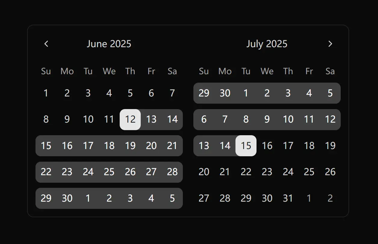
"The standard shadcn/ui Date Picker combines Popover and Calendar components to create a clean, functional date selection interface. Built on React DayPicker with Tailwind CSS styling, it provides single-date selection, date range selection, and time picking capabilities through date-fns formatting. The component uses Radix UI primitives and integrates with Tailwind utility classes. The default implementation works well for standard use cases where users need to select dates or date ranges."
The shadcn/ui Date Picker provides a clean, accessible date selection UI built from Popover and Calendar primitives and styled with Tailwind CSS. The component is implemented with React DayPicker, uses date-fns for formatting, and relies on Radix UI primitives to deliver keyboard navigation and accessibility. The default implementation supports single-date and date-range selection plus optional time picking, and it is customizable with Tailwind utility classes. Community-built extensions add features such as preset selections, comparison modes, time input controls, and timezone handling to meet analytics, booking, and enterprise requirements while maintaining consistent design.
Read at Jqueryscript
Unable to calculate read time
Collection
[
|
...
]