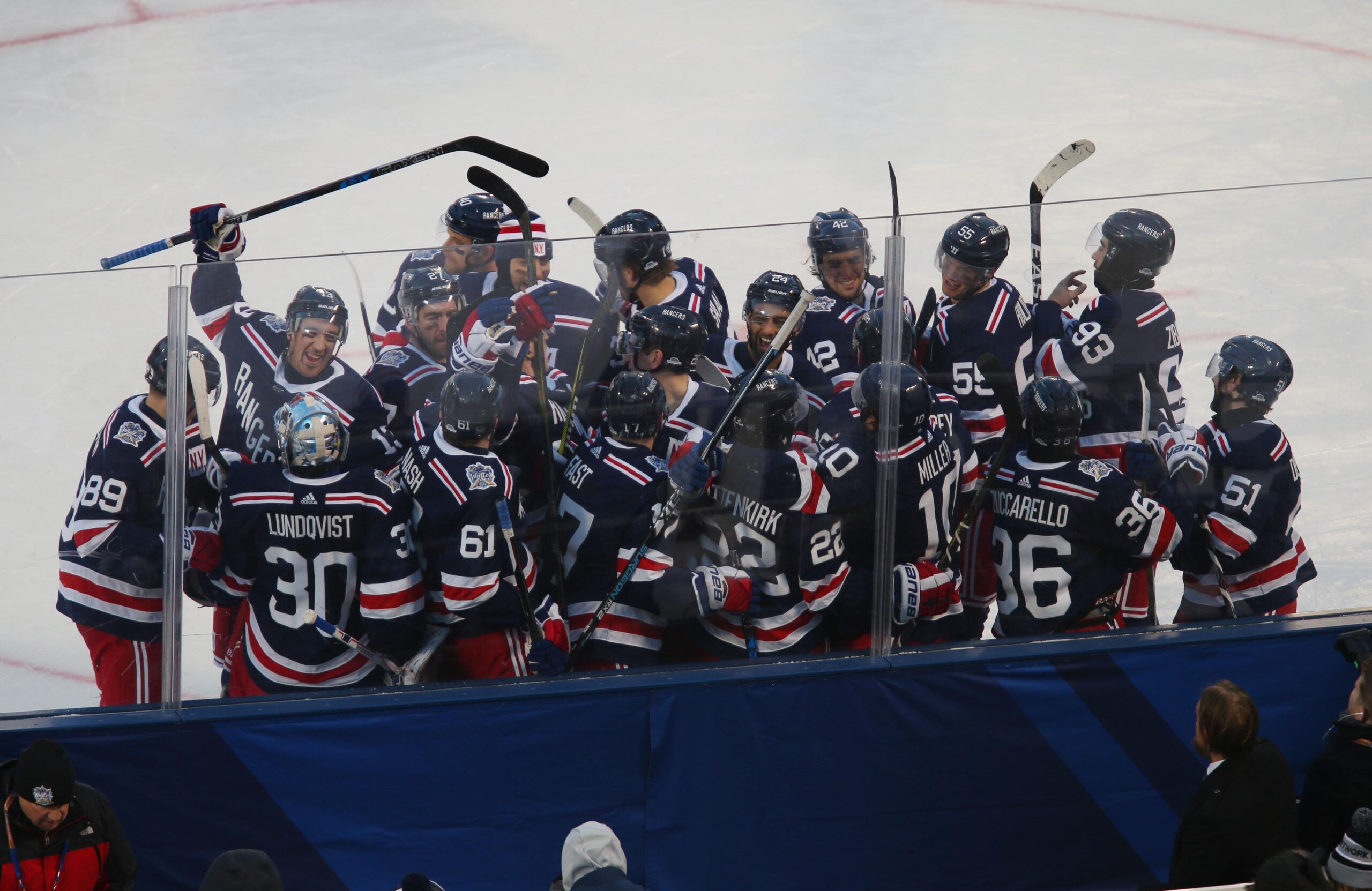
"The Rangers 2026 Winter Classic jersey has been revealed. Consistent with regular Rangers tradition, the jersey is another take on the less is more philosophy that the Rangers have stuck with throughout their 100 year history. It looks like the inverse of the Rangers centennial jersey, with the same shades of blue, white and red. At least to me. I'm color blind though (yes, for real), so I defer to those who can actually tell different shades of colors apart."
"Consistent with regular Rangers tradition, the jersey is another take on the less is more philosophy that the Rangers have stuck with throughout their 100 year history. It looks like the inverse of the Rangers centennial jersey, with the same shades of blue, white and red. At least to me. I'm color blind though (yes, for real), so I defer to those who can actually tell different shades of colors apart."
The Rangers 2026 Winter Classic jersey has been revealed and follows the team's less-is-more tradition. The design reads as an inverse of the centennial jersey and uses the same shades of blue, white, and red. Color perception is noted as uncertain by the observer due to color blindness, prompting deference to others for shade differences. Personal preference leans toward the centennial jerseys rather than the 2026 Winter Classic design. The 2012 Winter Classic jersey remains the preferred specialty jersey, described as the best the team has released in that category.
Read at Blue Seat Blogs
Unable to calculate read time
Collection
[
|
...
]