""It was the perfect storm of need and meaning coming together," says Steven Heller, reflecting on how the logo symbolized New York's desperate need for identity and pride."
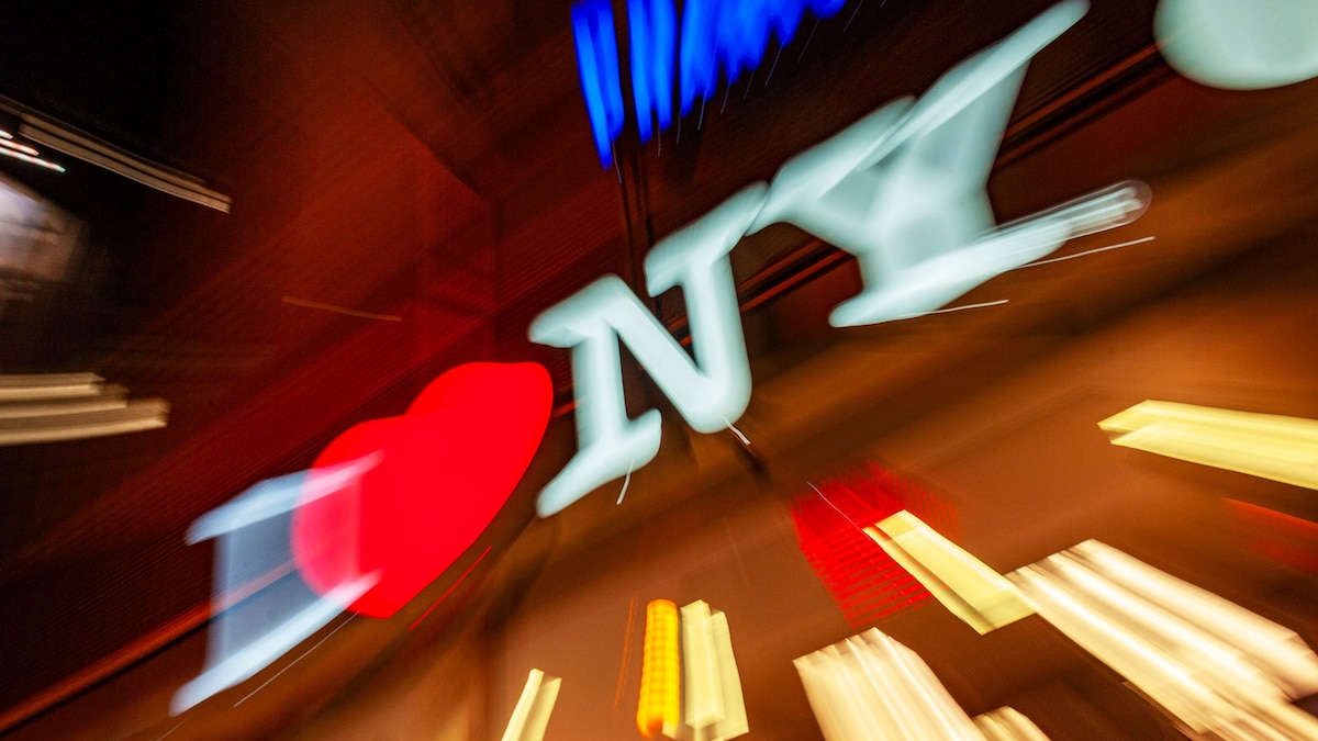
"Milton Glaser's original 1976 sketch for the 'I â¤ï¸ NY' logo was drawn in a taxi on the back of an envelope, evolving into a symbol of the city's resilience."
"His now-iconic 'I â¤ï¸ NY' logo became a rallying cry, a symbol of pride at a time when the city was desperate to believe in itself again."
"The design quickly captured the city's spirit and is preserved by The Museum of Modern Art as part of its permanent collection."
The 1977 blackout exposed New York City's severe financial and social struggles, with rampant fires igniting in neighborhoods like Harlem and the Bronx. In this climate of despair, designer Milton Glaser's 'I â¤ï¸ NY' logo emerged, not as a product of reform, but as a beacon of hope. Originally intended for a tourism campaign, the logo resonated deeply with New Yorkers, encapsulating their desire for pride and recovery. The Museum of Modern Art now honors Glaser's design, showcasing its significant role in reshaping the city's identity during a turbulent era.
Read at History
Unable to calculate read time
Collection
[
|
...
]