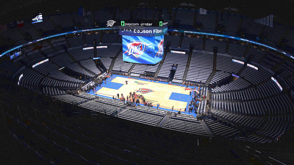
"One of the reasons we moved away from the logos on the courts is-whether it was perception or reality-there was a sense that maybe the logos added some slipperiness to the court, said NBA commissioner Adam Silver before Game 2."
"Some fans felt robbed of a unique Finals experience, claiming that the use of virtual logos led to a cluttered floor reminiscent of a NASCAR hood."
"The NBA Finals basketball court is typically void of specific branding, a departure from previous designs to maintain court integrity and avoid slipperiness."
"Virtual graphics aimed to enhance the viewing experience met criticism, as fans called them glitchy, with some even likening them to emojis."
The design of the NBA Finals basketball court has come under scrutiny after Game 2 between the Indiana Pacers and Oklahoma City Thunder showcased the regular court design, lacking any official Finals branding. While virtual logos were added for TV audiences, technical glitches and a cluttered look prompted complaints from viewers. NBA Commissioner Adam Silver noted that the decision to minimize logos stems from concerns over court safety and integrity, which has caused the Finals experience to feel less special for fans who desire a unique championship display.
Read at Fast Company
Unable to calculate read time
Collection
[
|
...
]