"The turn of the millennium saw the landscape of heavy music dominated by a particular album art aesthetic: jagged typography, graffiti-style emblems and distressed image filters. Some worked, some didn't, but the arrival of Sacramento alt-rockers Deftones' third LP, White Pony, with its silver sheen and quiet silhouette offered a stark and disarmingly clean alternative with not a gothic band logo in sight."
""I had to raise my hand for that one because it would have never happened," he states. "Being at Warner Brothers, I wouldn't have got a Maverick project, but we bent the rules because I wanted to do it so badly. Luckily, I got it and flew up to Sausalito to meet with the band and hear the record. The rest is history.""
"Released in 2000, White Pony's sleek minimalism stood apart from the era's visual clutter in much the same way that Deftones distanced themselves from the 'nu-metal' tag they were often lumped in with. Two decades on, Maddocks' and Deftones' relationship continues, spanning every record since, including their long-awaited tenth LP, Private Music. The collaboration has fostered something of a creative short-hand between Maddocks and Deftones' frontman, Chino Moreno."
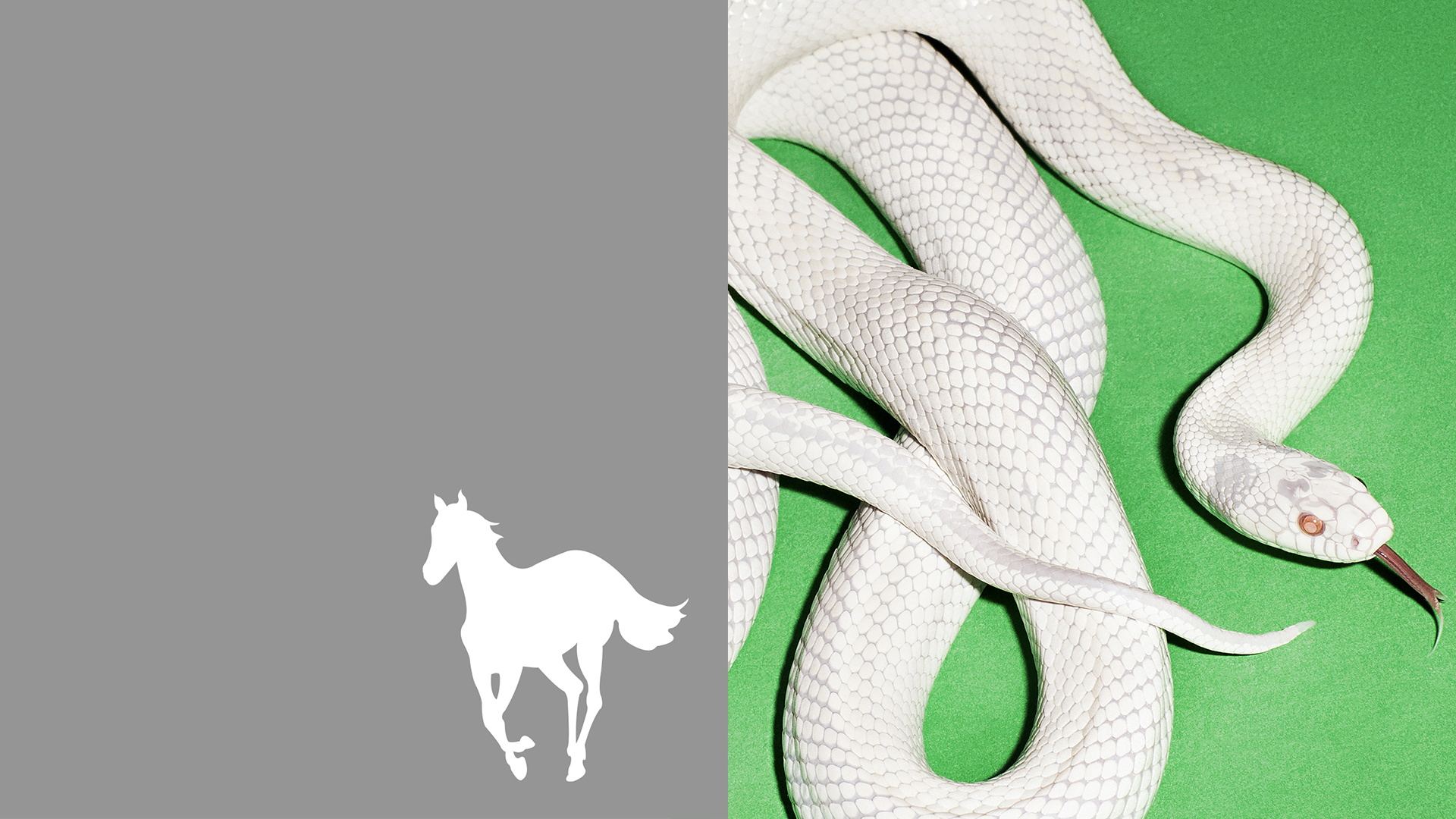
At the turn of the millennium heavy music album art favored jagged typography, graffiti-style emblems and distressed image filters. Frank Maddocks joined Warner Records in 1999 and secured the Deftones' White Pony project despite label boundaries. White Pony, released in 2000, used a silver sheen and quiet silhouette that contrasted the era's visual clutter and mirrored the band's separation from the nu-metal label. The collaboration between Maddocks and frontman Chino Moreno has continued across every subsequent Deftones record, producing motifs such as an iconic skull, sex tape–inspired aesthetics, and repurposed wildlife photography through Private Music.
Read at Creative Bloq
Unable to calculate read time
Collection
[
|
...
]