""Your assessment is accurate," she said with a slightly rueful nod, whereupon she and her team opened the new one that will be pushed out this morning. They're proud of it, and Rieara explained that its predecessors were catch-up attempts that displayed some of the haste of their development. "We were so far behind," she admits, "and it was embarrassing.""
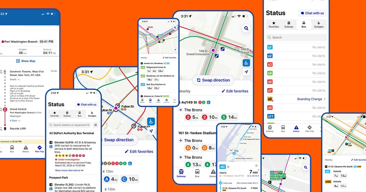
"My first impression is, simply at a visual level, it looks sharp. It incorporates the colors and symbols pioneered by the so-called Vignelli diagram - Unimark's 1972 subway map, a graphic-design landmark, beloved and hated, discarded then updated and reintroduced, its merits debated for decades."
The MTA app, launched in 2024, is receiving an update to enhance its functionality and user experience. The previous version was criticized for its performance, particularly in bus navigation and frequent technical issues. Shanifah Rieara, the MTA's chief customer officer, acknowledged the app's shortcomings and expressed pride in the new version. The updated app features a visually appealing design inspired by the Vignelli diagram, aiming to unify the MTA's graphics and improve overall usability for travelers.
Read at Curbed
Unable to calculate read time
Collection
[
|
...
]