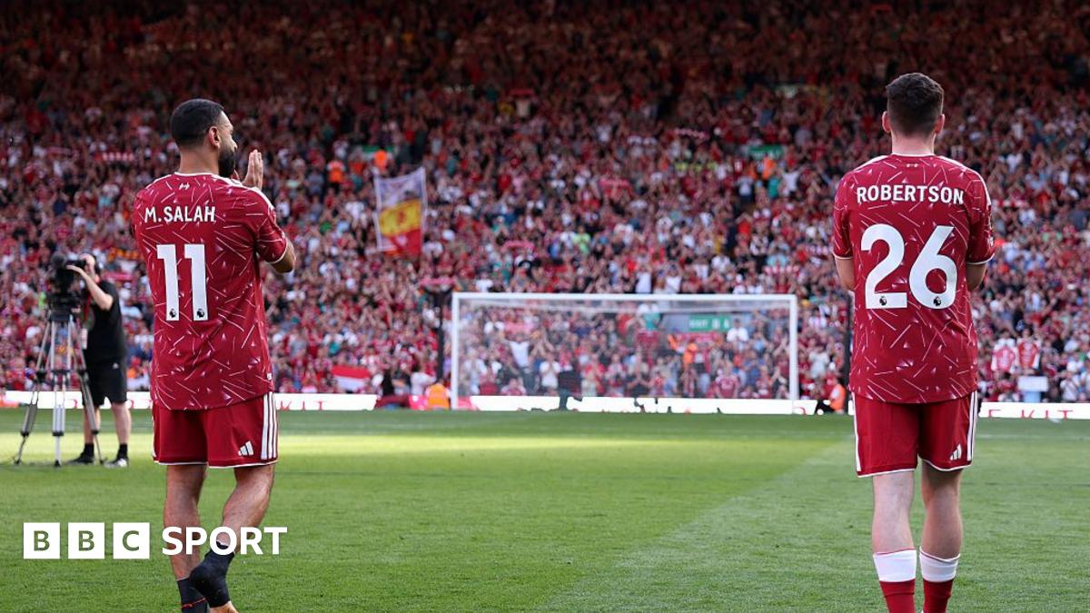
Liverpool debuted a new home kit at Anfield during a 1-1 draw with Brentford, with fans noticing the shirt and shorts did not appear to match in shade. The kit is inspired by the adidas design from the 1989-90 title-winning campaign and features a dynamic geometric pattern. Social media reactions focused on differences in red tone and pattern between the top and shorts, with some viewers also noting colour grading differences in broadcast coverage. The disparity is understood to be less noticeable in person and is described as deliberate, matching the approach used in 1989-90. Liverpool stated the kit is completed with deep red shorts and socks for a unified look, and it remains unclear whether changes will be made before next season.
"I know this isn't the main point or anything but I cannot believe they are the actual shorts that go with that new shirt. They're a completely different shade of red."
"That Liverpool kit ain't it. The shorts and the top are completely different. Different pattern and shade of red."
"The new home shirt draws inspiration from the original adidas design, instantly recognisable for its dynamic geometric pattern, combining timeless club heritage with modern performance design. The 2026/27 Home kit is completed with deep red shorts and socks, creating a bold, unified look."
"For those watching coverage of the match, there was a clear difference between the colour grading on the shirt compared to the shorts but the understanding is that the disparity is not as visible in person, as you can see in official photographs."
Read at www.bbc.com
Unable to calculate read time
Collection
[
|
...
]