"Nobody would credit Zohran Mamdani's campaign graphics for his win, but they were, like his campaign, like nothing else in politics."
"Most political logos are red-white-and-blue, and the blue is usually in a narrow range from Pantone 286."
"A long-odds candidate, like Amy Klobuchar in 2020, will now and then toss an extra color into the mix, perhaps out of a desire to stand out."
"Some of those visual identities are sophisticated, the breakthrough being Barack Obama's 2008 campaign materials incorporating the Gotham typeface."
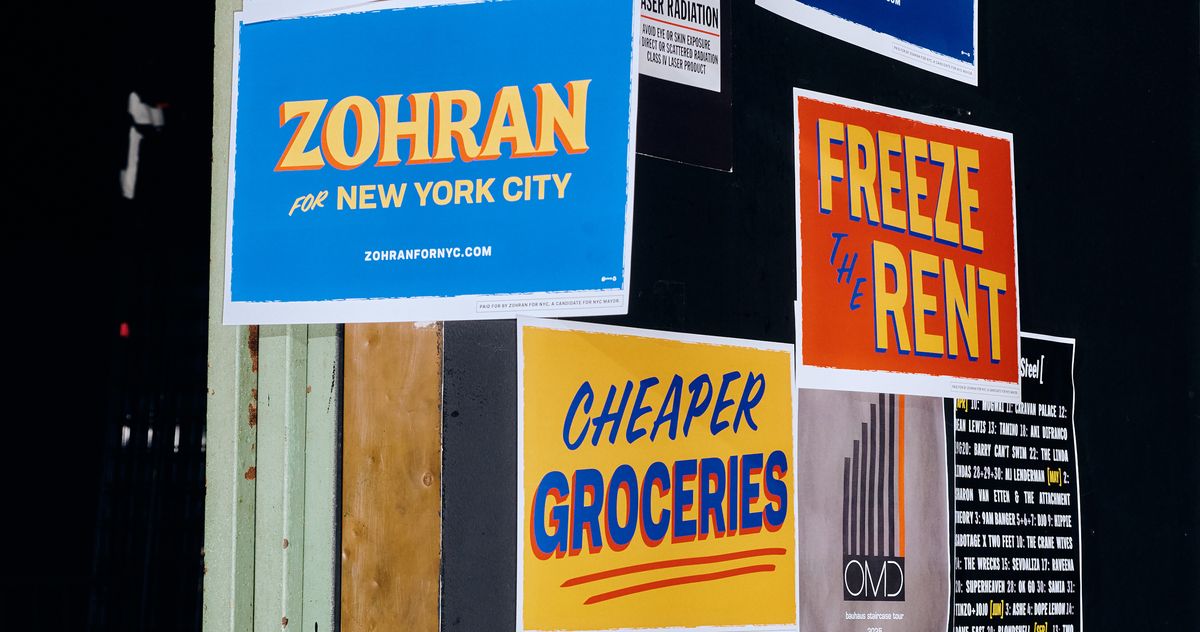
Zohran Mamdani's campaign graphics stood out in the political landscape, eschewing traditional designs for a vivid aesthetic featuring bold colors and playful elements. Unlike typical red-white-and-blue logos, his materials, such as 'HOT GIRLS FOR ZOHRAN' T-shirts, showcased a distinct style reminiscent of hand-painted store awnings. This divergence from standard political branding reflects a trend toward more personal and relatable imagery, seeking to connect with voters in a manner that feels fresh and engaging, contrasting sharply with the typical, corporate-inspired campaign visuals seen in politics.
Read at Curbed
Unable to calculate read time
Collection
[
|
...
]