"Czech designer Kostya Petrenko has taken his love for retro visuals a step further with a new project that imagines what famous city logos might look like if they'd been designed in 1984. After playing with global brands in his earlier 1980s Rewind series, he's now turning that same nostalgic lens toward cities around the world, channeling the glow of arcade screens and the quirky charm of latenight TV graphics."
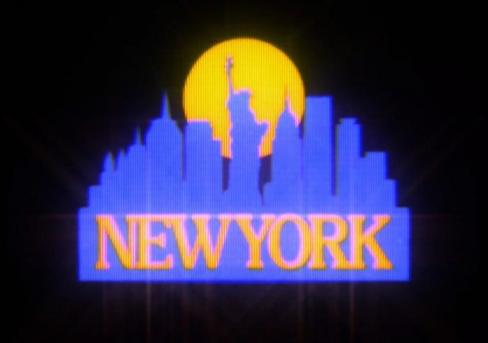
"New York shows up in bright blue and yellow, paired with a strippeddown skyline and a glowing sun. Tokyo gets bold geometric lettering, a striped rising sun and the unmistakable shape of Mount Fuji. London becomes a neonyellow Big Ben, and Berlin's TV Tower turns into a vibrant target made of layered reds and oranges. Rome, Prague, Miami and Kyiv follow suit, each reduced to clean silhouettes, heavy gradients and punchy color combos that feel straight out of the '80s."
Kostya Petrenko reimagines famous city logos as if designed in 1984, using neon palettes, bold geometry, simplified skylines and heavy gradients. New York appears in bright blue and yellow with a strippeddown skyline and a glowing sun. Tokyo uses bold geometric lettering, a striped rising sun and the unmistakable Mount Fuji silhouette. London becomes a neonyellow Big Ben and Berlin's TV Tower converts into a layered, vibrant red-orange target. Rome, Prague, Miami and Kyiv are reduced to clean silhouettes and punchy color combinations. Short looping animations add scanlines, bloom and tiny distortions to mimic CRT screens and reinforce a playful, nostalgic atmosphere.
Read at designyoutrust.com
Unable to calculate read time
Collection
[
|
...
]