Margaret Atwood's The Handmaid's Tale, especially highlighted through its 2017 TV adaptation, intricately employs color theory in its costume design to reflect themes of power and oppression. The striking use of color not only identifies character statuses—such as the red uniforms of handmaids representing damnation and sexual sacrificial roles—but also conveys deeper meanings. The serenity of the commander's wives in teal and the anonymity of Martha’s earth-toned outfits establish a complex visual hierarchy that enhances the overarching narrative.
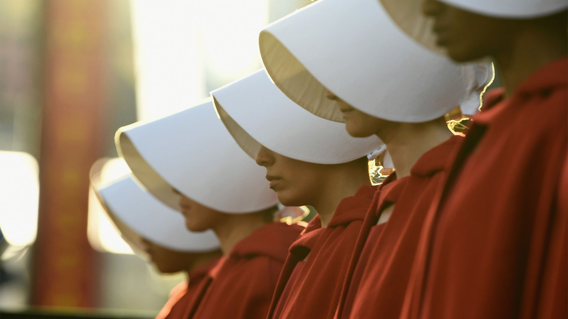
"At its core, The Handmaid's Tale's costume design is a matter of status. Each handmaid is given a red 'uniform' - a scarlet letter that distinguishes them as 'other' while making them easily identifiable should they attempt a futile escape."
"The red of their garments marks the blood of their bodily sacrifice as a surrogate, but with this sexual sacrifice comes an innate shame."
"On the other side of the colour spectrum, the cool teal uniform of the commander's wives carries a serenity and purity. Akin to the Virgin Mary, there's an unspoken respect in the formal, sexless, almost corporate appeal of the blue shade."
"The earth tones of the Martha's uniforms act as a veil of anonymity. Dull and accessible, the plain garments are devoid of any status, value."
Read at Creative Bloq
Unable to calculate read time
Collection
[
|
...
]