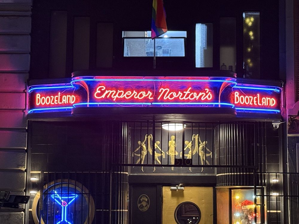
"But depending on what gas you use, it turns different colors, and neon can soothe the eyes. Image: Joe Kukura, SFist The bar previously had a neon sign, but it was just one color, and far more primitive, dating back to the bar's 2013 opening in the Jezebel's Joint/Deco Lounge days. When we came in, we had that beautiful marquee, with the two horizontal blue neons, which I've always loved, and I realized that those weren't original to the building, DeMattia says."
"We put the Boozeland' big in the middle and the Emperor Norton's' on either side, and it always just didn't quite look right to me, he explains. We used Comic Sans for the font, the Boozeland,' which we thought looked cool, but people who were in graphic design were horrified. They're like That is so ugly, why would you use Comic Sans?'"
Emperor Norton's Boozeland on Larkin Street showcases extensive memorabilia related to Norton I, including original currency, artwork, and a back-patio mural. The bar installed a costly custom neon marquee that uses Emperor Norton's actual signature as the 'Emperor Norton's' lettering. Co-owner Kevin DeMattia describes neon as responsive to different gases and colors and says the new display improves on a one-color sign from 2013. The previous neon used Comic Sans and an awkward layout. DeMattia collaborated with Jim Rizzo of Neon Works in Oakland and others to design and install the signature-based neon facade.
Read at sfist.com
Unable to calculate read time
Collection
[
|
...
]