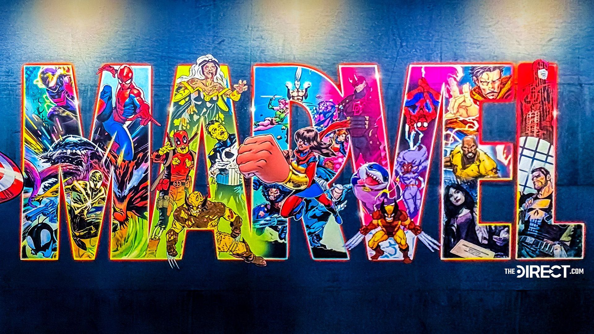
Marvel revealed a redesigned wordmark flooded with character cameos spanning the franchise. The artwork repeats certain characters—Wolverine and Spider-Man appear three times each—while flagship heroes such as Thor, Captain America, and Hulk are absent. Jeff the Land Shark appears as a noted surprise cameo. Reactions divided: many praised the nostalgia and dense references, while others criticized the palette and composition as overly bright, crowded, and visually overwhelming. Specific viewer responses included descriptions like 'too busy,' 'overstimulated,' and 'The ugliest one so far.' The studio previously updated the logo last year, suggesting another redesign could appear soon.
"A vibrant spin on the classic Marvel wordmark logo, the new design is packed with iconic characters from across the studio's franchise. Some seemed to get more love than others, with Wolverine and Spiderman appearing three times each, while classics like Thor, Captain America, and Hulk were mysteriously missing. (Although major fan service points must be awarded for the Jeff the Land Shark appearance.)"
"While some fans appreciated the array of cameos, others found the overly bright, crowded design a little too much, with one fan writing, "While I appreciate the effort to be vibrant, this new logo just feels too busy and visually overwhelming." Another added, "I feel overstimulated looking at this," while one fan called the new design "The ugliest one so far.""
Read at Creative Bloq
Unable to calculate read time
Collection
[
|
...
]