""I've had to put a lot of myself into Balenciaga," he stated. That sounds crazy, but it's true - Balenciaga was all couture cocoon coats, pillbox hats and gazar. But it isn't a brand - there's no real logo, no easily extrapolated prints, or emblems. It was about pure architecture, which is a couturier's dream, but a brand builder's nightmare. Unlike, say, Gucci, which has a whole array of signs and signifiers, insignia and emblems to choose from."
"Because alongside all the bits that spell out Gucci - literally in GG's that reference the founder Gucci Gucci's initials, and figuratively in instantly identifiable prints and green-red colours and horse-bits borrowed from an imaginary bit of chic, aristocratic equestrianism - there's an inherent, innate sense of Italianness, an abstract notion of nationality embedded in Gucci. Florentine, yes, but more general than, say, the cool Milan-ity of Armani, the Roman grandeur of Valentino, or Versace's Calabrian, scorched-earth approach to taste."
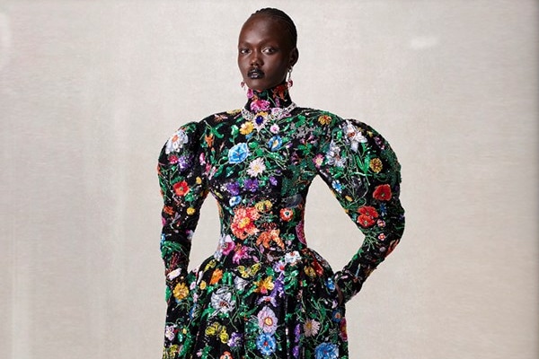
Gucci's Spring/Summer 2026 reworks historical signatures — Tom Ford-era references, Frida Giannini flourishes and 1970s licensee logo mania — through Demna's viewpoint. Demna contrasted his Balenciaga experience of architectural, logo-free couture with Gucci's rich emblematic language and deliberately inserted personal direction. The collection foregrounded GG initials, signature prints, green-red stripes and horse-bits while invoking an abstract Florentine Italianness distinct from Milanese or Roman archetypes. The result balanced transparent, sexualized pieces and contradictory codes to create a nostalgic yet modern reimagining of heritage motifs as contemporary statements.
Read at AnOther
Unable to calculate read time
Collection
[
|
...
]