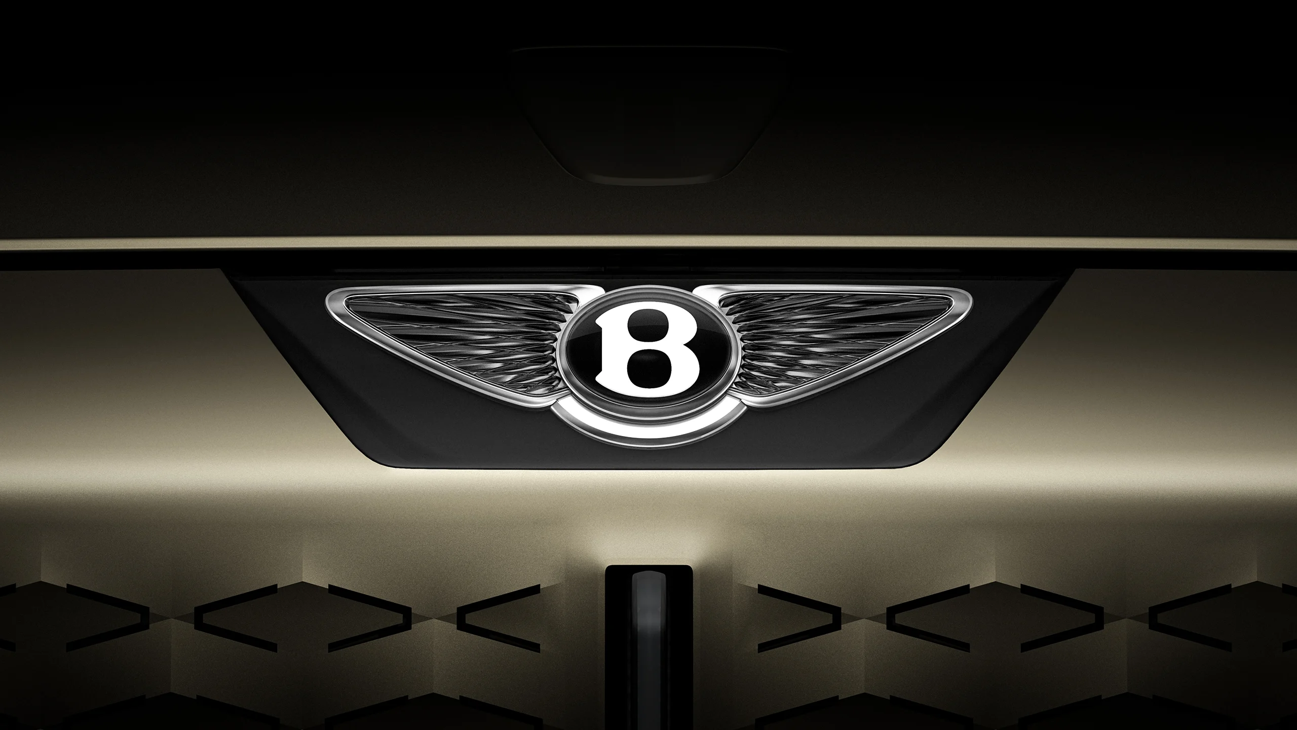
"The mission in designing the new emblem was to capture some of the beautiful details from the previous designs - for example, the diamond pattern of the inner wings and the B 'centre jewel' - but create a more modern and progressive design."
"The new wings have been reshaped and abstracted with the feathers turned into a radial diamond design. The B mark was redesigned to stand on its own as a mark without wings."
Bentley has introduced a significant redesign of its emblem, the 'Bentley Wings,' for the fifth time since its 1919 founding. The new logo, developed by an in-house team led by Robin Page, features a sleek, minimalist design while retaining core elements. The wings are now abstracted into a radial diamond shape, and the B mark can stand alone without the wings. This redesign captures aspects of the previous designs while aiming for a modern interpretation influenced by luxury watch design and the peregrine falcon's wings.
Read at Fast Company
Unable to calculate read time
Collection
[
|
...
]