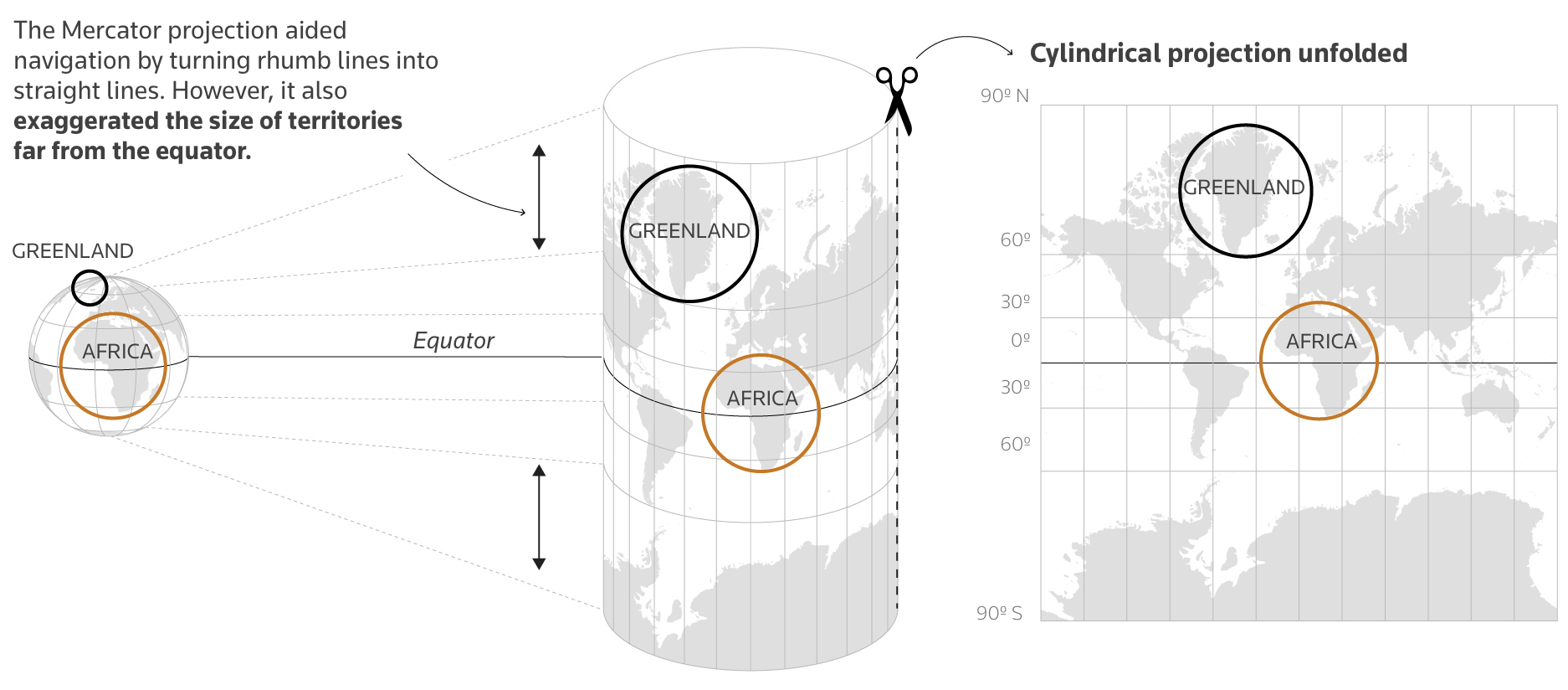
"For Reuters, Mariano Zafra and Sudev Kiyada highlight the true size of Africa and use the opportunity to describe map projections with handy illustrations. You would think by now, after many maps, illustrations, and interactive graphics, we would have a better intuition for the pros and cons of different map projections. But then the African Union wouldn't still need to campaign for anything other than the Mercator projection. For scale, Reuters also includes a bunch of countries crammed into Africa's borders:"
"You would think by now, after many maps, illustrations, and interactive graphics, we would have a better intuition for the pros and cons of different map projections. But then the African Union wouldn't still need to campaign for anything other than the Mercator projection. For scale, Reuters also includes a bunch of countries crammed into Africa's borders: This is a nice riff on a 2010 map of the same theme."
Africa's land area is far larger than commonly perceived, large enough to encompass multiple countries' territories within its borders. Common map projections, such as Mercator, distort relative sizes and exaggerate the scale of regions away from the equator, reducing intuitive understanding of continental proportions. The African Union advocates for alternatives to Mercator to better reflect true area relationships. Visual comparisons place several nations inside Africa to demonstrate scale, and updated infographics revisit earlier map riffs to clarify projection trade-offs and provide interactive illustrations that reveal how different projections change perceived geography.
Read at FlowingData
Unable to calculate read time
Collection
[
|
...
]