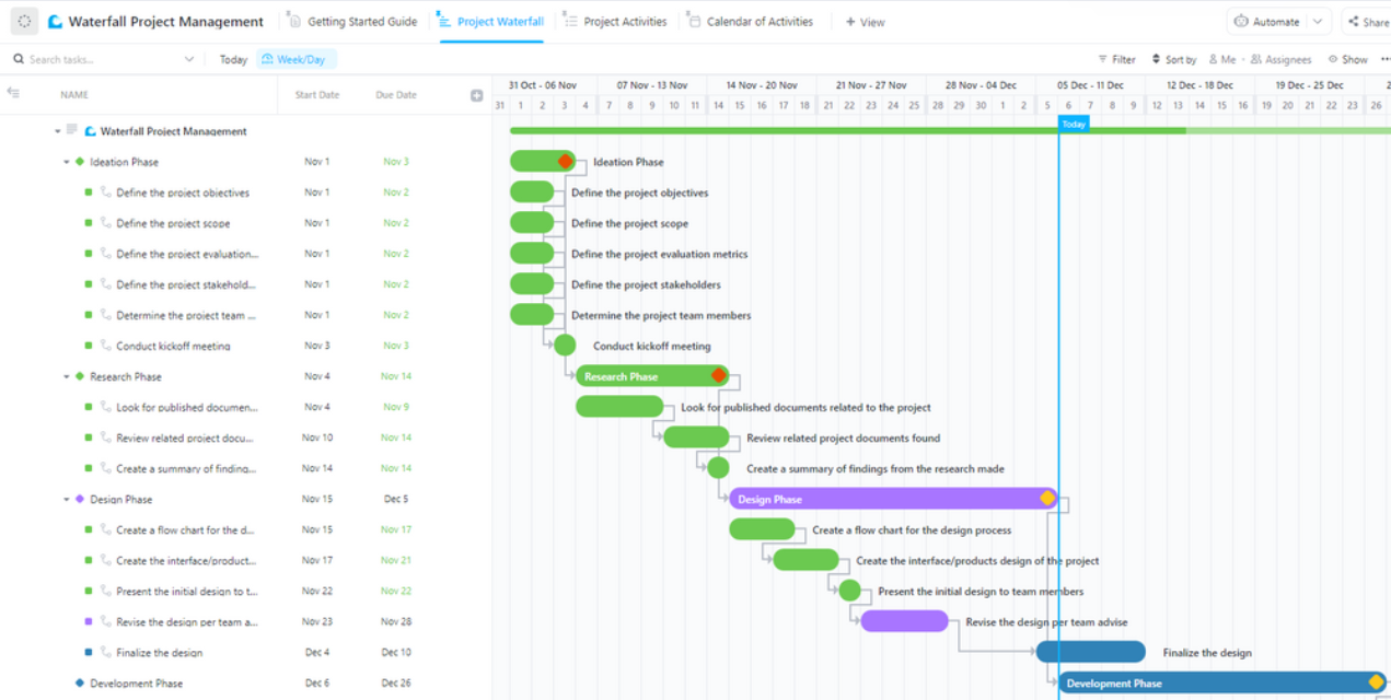
"A waterfall chart in Google Sheets is an effective visualization tool, clarifying how positive and negative values contribute to overall results, starting each bar where the previous one ends."
"Despite the value of waterfall charts, many experienced professionals find it challenging to create them in Google Sheets. This article provides a detailed, step-by-step guide to simplify the process."
"Organizing your data correctly is crucial before making a waterfall chart, requiring category labels and numeric data to accurately visualize revenue, expenses, and profits."
"Through the Chart editor in Google Sheets, users can customize titles, colors, and data labels for their waterfall charts, enhancing visual clarity and data presentation."
The article emphasizes the importance of waterfall charts in Google Sheets for visualizing financial data, such as revenue, expenses, and profits. It highlights how these charts facilitate understanding by ensuring each bar begins where the previous one ends. A step-by-step guide is provided, starting with organizing data correctly and continuing through the chart creation process in Google Sheets. Despite their effectiveness, many professionals struggle to create these charts, making this guide particularly useful. The article also discusses customizing charts for better clarity and presentation.
Read at ClickUp
Unable to calculate read time
Collection
[
|
...
]