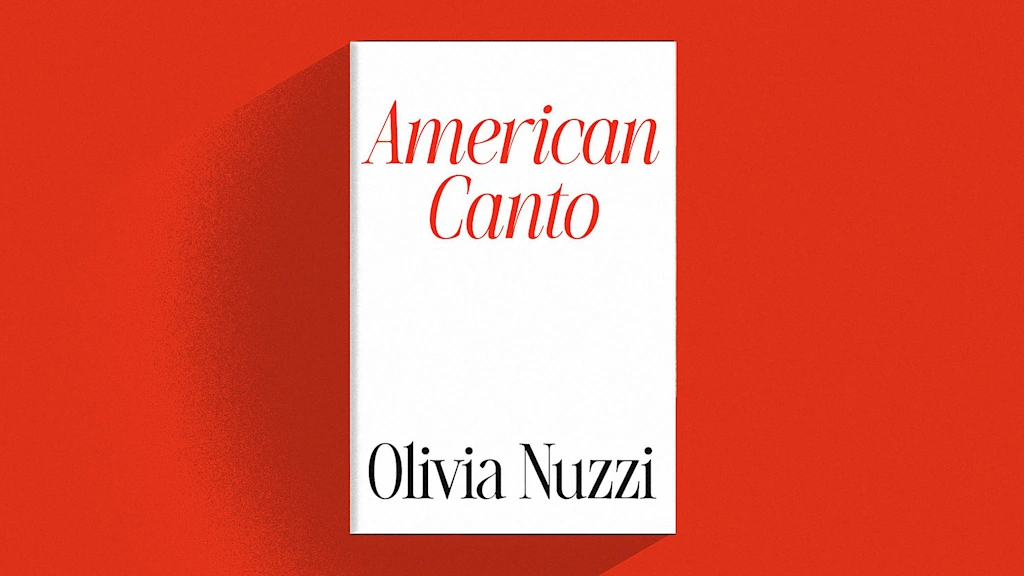
"Judge a book by its cover, and you might think that American Canto, the memoir by Vanity Fair's outgoing West Coast editor Olivia Nuzzi, is destined to be a classic. The memoir, which chronicles Nuzzi's drama-filled life and career as a political reporter in the Trump era, features a strikingly simple cover that serves as shorthand for the book's ambitions. "The intent was to give the book a clean, no-frills design that felt both classic and contemporary,""
"Nuzzi's book features a stark white cover with the title and her name rendered in a serif typeface inspired by fashion magazine typography of the 1980s. The typeface does a lot of work for the book, which appears to be off to a slow start amid the ongoing media storm surrounding its rollout. A political reporter since 2014, Nuzzi was fired last year from New York magazine following an alleged relationship with now-Health Secretary Robert F. Kennedy Jr."
American Canto uses a stark white cover and a serif typeface inspired by 1980s fashion magazine typography to project a classic, contemporary aesthetic. Simon & Schuster senior art director Alison Forner aimed for a clean, no-frills design. The typeface plays a central role in the book's presentation even as early sales and media reaction have been uneven amid surrounding controversy. The publisher frames the book as a character study of national change, while critics have labeled it a "tell-nothing memoir" and compared its interest unfavorably to the scandal around its author. Most current bestsellers tend to use images rather than type-led covers.
Read at Fast Company
Unable to calculate read time
Collection
[
|
...
]