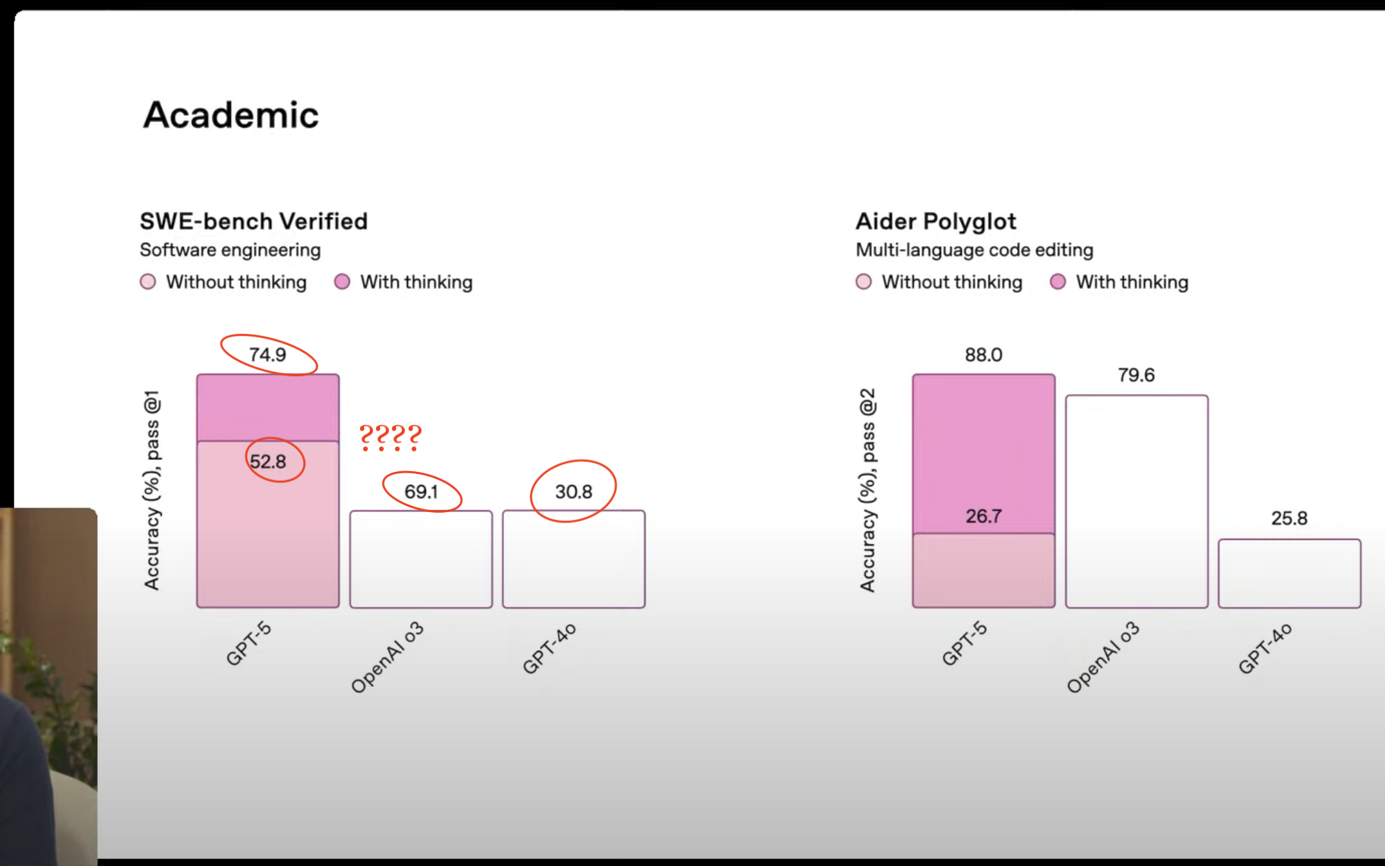
OpenAI introduced GPT-5 and showcased performance improvements through charts. However, the benchmark charts misrepresented data, with bars not aligning with their percentage labels. Specifically, a bar labeled 69.1% was the same height as one for 30.8%, despite the former being expected to be over twice that height. Furthermore, a bar for 52.8% was taller than the one for 69.1%, indicating inconsistencies. The chart sophistication raises concern, as trust in the tool is important, especially when it comes to accuracy.
"The point was to show the improved performance of GPT-5 over previous models. However, the labels do not remotely match the bar heights."
"The bar for 69.1% is the same height as the one for 30.8%, when the former should be more than twice the height of the latter."
"The bar for 52.8% is taller than the one for 69.1%. It's off."
"They don't say if the charts were made with ChatGPT, but it's not the best look to use a botched chart when talking about the accuracy."
Read at FlowingData
Unable to calculate read time
Collection
[
|
...
]