#uiux
#uiux
[ follow ]
#figma #web-development #design-tools #web-design #prototyping #css #ai-design-tools #performance #usability
fromYanko Design - Modern Industrial Design News
2 days agoNocturne's Free App Turns Your Bricked Spotify Car Thing Into Something Better Than the Original - Yanko Design
The Spotify Car Thing joined that lineage in December 2024 when Spotify killed server-side authentication and turned every unit into an expensive knob with a screen attached. Nocturne picked up where Spotify dropped off. The project launched in October 2024, anticipating the shutdown, and has shipped four major versions since. V4.0.0, currently in beta with a public release imminent, finally delivers true Bluetooth connectivity without phone tethering, a companion app, and a feature set that makes the original Spotify firmware look like a rough draft.
Gadgets
fromSitePoint Forums | Web Development & Design Community
1 month agoWhat matters most for user engagement: performance or UI?
Performance is a critical factor in user engagement, where even minor delays in loading can deter users. A clean and simple user interface also contributes significantly to user retention.
UX design


fromMedium
3 months agoFeelings are the new features
Your junior designer spins up a prototype in Lovable before lunch. Your PM shows you a "working" MVP built entirely with Cursor within a day. And your CEO forwards you a LinkedIn post about how AI will replace 80% of UI work by 2026. And it seems like anyone can now make an app to solve a specific problem. Has the graphical interface really died, as Jakob Nielsen provocatively suggests?
UX design
fromModern Farmer
4 months agoResearch-Backed Review of Ricky Casino - Platform Innovation - Modern Farmer
Integrated social features allow users to share their achievements interact with other players and participate in community challenges thus creating an enriching social dimension and fostering long-term engagement on the platform. Interface design automatically adapts to various screen sizes and device orientations delivering optimal visual experience across desktop tablet and mobile devices through native apps or web browsers. Technical infrastructure is built on distributed server networks ensuring fast loading times smooth navigation and responsive performance even during high-traffic periods maintaining consistent user experience quality.
Law
fromLogRocket Blog
5 months ago10 best hero section examples and what makes them effective - LogRocket Blog
A hero section is the first, visually prominent UI block at the top of a web page or digital product screen. Its job is to welcome users, present the product value at a glance, and effectively guide them to a desired primary action. It improves the first user impression with the product using a compelling headline, supporting copy, and CTAs (call-to-action), and other visual enhancements.
UX design

fromGSMArena.com
6 months agoPoll results: thank you for your suggestions on improving the Phone Finder's search for foldables
The majority of people prefer that only folded dimensions are used when filtering phones based on their thickness, width and height. People had a simple reason for voting this way - most of the time, the phones stay folded. You carry them closed, of course, but with the rapid improvement of cover displays (especially on flip foldables), you can get a lot done without opening the phone.
Mobile UX


fromSitePoint Forums | Web Development & Design Community
7 months agoIs Colour Prediction Game is made up of HTML And CSS?
Yes, many colour prediction games are built using HTML and CSS along with other web technologies. HTML is used to structure the game layout, while CSS helps design the look and feel, including colours, buttons, and animations.
Web development
fromSearch Engine Roundtable
8 months agoMicrosoft Bing Search Floating Copilot Search Box With Keyword Suggestions
In June we reported that Microsoft was testing a floating Copilot search box in the Bing Search results interface. Now, Microsoft added keyword suggestions next to the floating Copilot search box to help you figure out what to search for. This update was spotted by Sachin Patel who shared this screenshot on X showing these three keyword phrases floating next to the already floating Copilot search box:
Artificial intelligence

Graphic design
fromClickUp
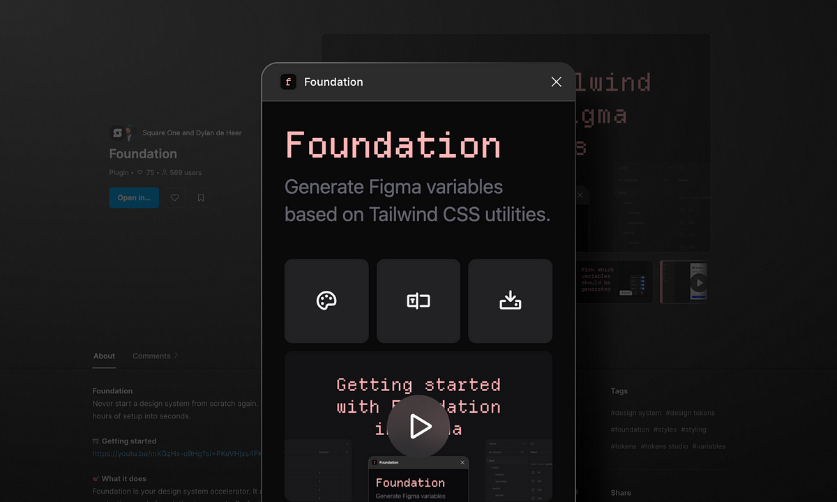
11 months agoFree Figma Style Guide Templates to Create Consistent Designs
Design inconsistency can be easily avoided with a comprehensive style guide.
Figma templates simplify the style guide creation process, enhancing design consistency.
A strong mission statement should guide the choice of design elements.
fromSitePoint Forums | Web Development & Design Community
1 year agoHelp: Responsive Html Website Design
When designing for mobile, it's crucial to examine your CSS styles closely. Extensive margins or paddings can create unintentional whitespace, making the page look unprofessional. As a best practice, consider using percentage-based values or media queries to adjust the layout dynamically based on screen size. This way, you can ensure that your site maintains a balanced look across different devices without the unnecessary empty space.
Web design
[ Load more ]