UX design
fromJonnyburch
12 hours agoI love AI, but it still can't design for shit
AI lacks a critical eye for its own output, leading to poor presentations and accountability issues for users.
"Given the impetus of the plot involves James Bond - the world's most famous spy - undertones of the genre of intelligence and espionage are alluded to, in both the choice of a monospace typeface, ABC Rom Mono, and in the widely tracked, code-like setting of it."
I'm heavily inspired by radical print design, particularly of the 70s after the birth of the Xerox, such as Shrew and OZ Magazine as well as protest banners and zines. I love the fast-paced, imperfect, tactile feeling and I try to emulate this through physically editing my work.
In a world where audiences are flooded with content, cutting through the noise requires more than visibility. Organizations increasingly invest in storytelling and narrative strategists to shape everything from brand voice to internal alignment.
We've both fought against needless promotional content before and lamented that frontier AI platforms are falling into the same pattern. As designers and users, we've learned that "free" usually means putting up with interruptive, slightly creepy ads that feel more like a tax than a benefit - a frustration tax that now colors how we approach free‑tier services and now AI tools.
Static images don't show motion. You can't inspect real product structure. You don't see how interfaces evolve over time. You rarely understand what actually works in production. So I decided to go deep. I reviewed every major design reference platform I could find - not just the popular ones - and analyzed how they actually help in real-world work. The conclusion?
Fashion is more than a visual medium. The thoughts, ideas and voices of designers drive our industry also. For the past quarter-century, we have been fortunate enough to speak to its greatest names, those who have defined and redefined their metier in the 21st century.
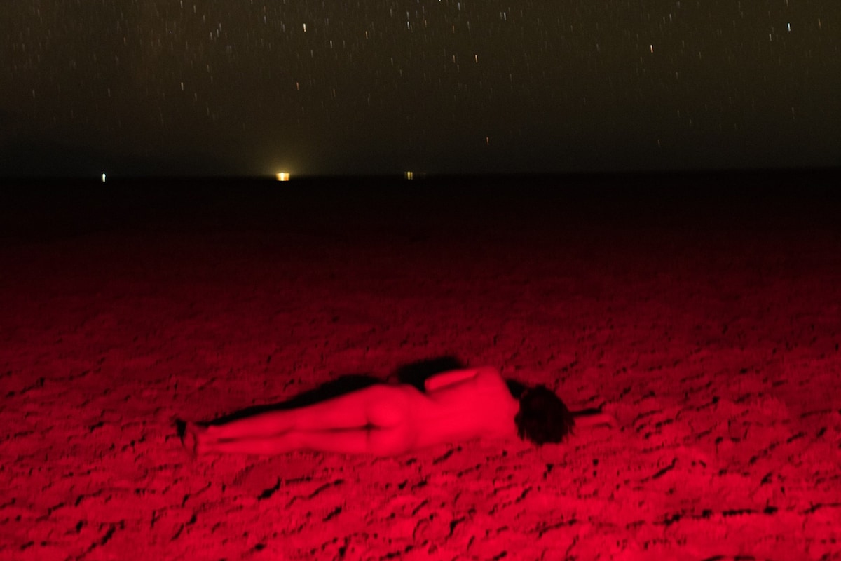
There is a certain kind of presence that requires no grand staging. The editorial "Saint" captures exactly this moment: the intersection of youthful nonchalance and a nearly statuesque stillness. While the first part of the series maintained a cool distance in gleaming white, the continuation dives into an atmospheric darkness. Here, the boundaries between shadow and silhouette blur, lending the series a nearly sacral, heavy depth.
The main problem with the existing homepage was that, besides the most recent posts, other content, once it aged and 'fell off' the front page, was then difficult to discover. The new design makes more use of available screen 'real estate', is visually much richer, and reorganizes 18 years of posts, so that even older long-forgotten posts are more easily found.
.jpg)