#artificial-colors
#artificial-colors
[ follow ]
#interior-design #color-perception #color-trends #design #home-improvement #technology #lighting-design


#lighting-design


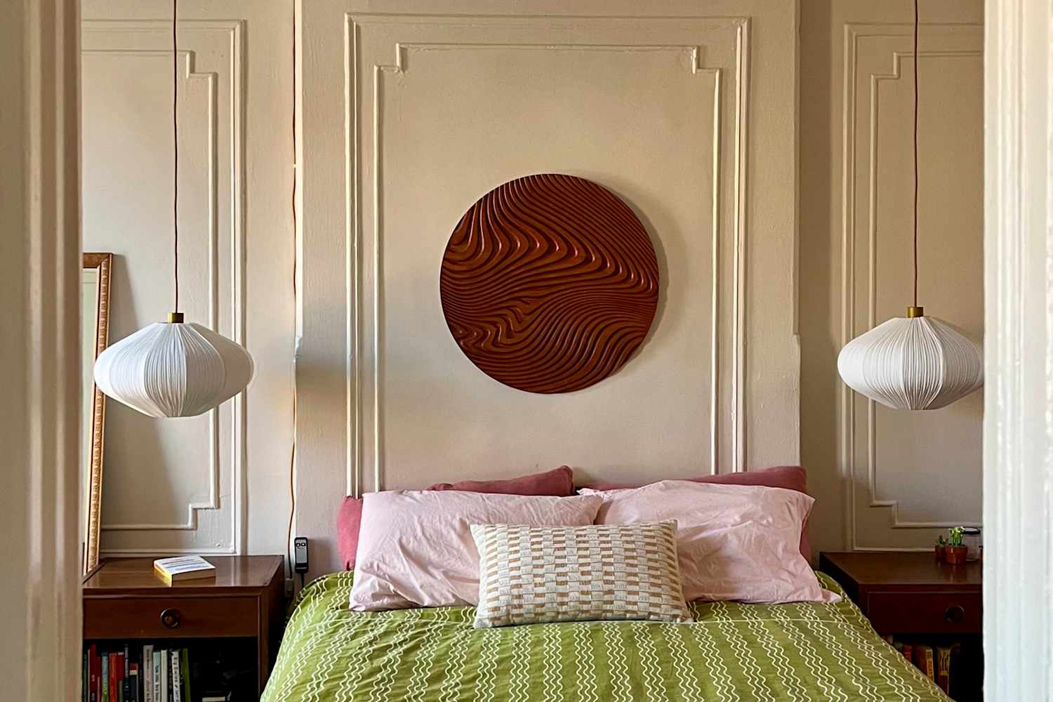
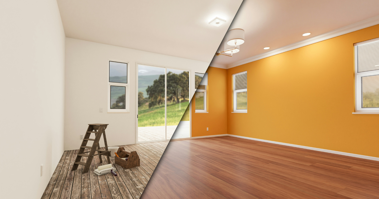
Renovation
fromRedfin | Real Estate Tips for Home Buying, Selling & More
1 month ago5 Reasons Why Lighting Design Matters More Than You Think in Home Interiors
Thoughtful lighting design enhances home comfort, style, and well-being by supporting circadian rhythms and transforming how spaces feel and function.
Web design
fromYanko Design - Modern Industrial Design News
2 weeks agoPixel 10a Just Proved a Smartphone Color Can Actually Mean Something - Yanko Design
Google's Pixel 10a Isai Blue celebrates individuality through a unique color and exclusive designs by artists with disabilities, marking a significant cultural expression.
fromMail Online
3 weeks agoWhat colour are the dots in this optical illusion?
'In this paper a novel optical illusion is described in which purple structures (dots) are perceived as purple at the point of fixation, while the surrounding structures (dots) of the same purple colour are perceived toward a blue hue.'
Science
fromDesign Milk
2 weeks agoTSATSAS Unveils a New Hue for the 931 Bag by Dieter Rams
I designed this bag in the same way I designed everything else, so largely based on right angles, but perhaps a little more emotionally, more personally. Designing a handbag is undoubtedly different to designing a Braun stereo system, but I applied the same principles. It had to be functional, visually durable, and very aesthetic. Less, but better.
Fashion & style

Design
fromdesignboom | architecture & design magazine
1 month agoa rich palette of saturated hues meet industrial precision in mara's renewed digital identity
Mara enters 2026 as a global interior design protagonist, expanding from office and hospitality into residential markets while strengthening its digital identity and sustainability commitment.
Fashion & style
fromwww.theguardian.com
1 month agoJess Cartner-Morley on fashion: primary colours are back, but styling them isn't child's play
Primary colors are returning to fashion runways after a decade of muted tones, but wearing them requires strategic styling to avoid appearing basic or unsophisticated.
fromColossal
2 months agoWith 200+ Artworks, 'Rainbow Dreams' Revels in the Vast Creativity of the Color Spectrum
From Do Ho Suh's ethereal architecture to Kimsooja's irridescent mirrors to Lauren Halsey's fringed tapestry, a new book from Monacelli celebrates a broad spectrum of light and color. Rainbow Dreams features more than 200 installations, sculptures, paintings, photographs, and more that revel in the possibilities of pigment. Bound in a smooth gradient that extends to the pages' edges, this vivid survey is a celebratory, playful object in itself.
Books
fromSubstack
2 months ago20 Design Reference Platforms Beyond Dribbble
Static images don't show motion. You can't inspect real product structure. You don't see how interfaces evolve over time. You rarely understand what actually works in production. So I decided to go deep. I reviewed every major design reference platform I could find - not just the popular ones - and analyzed how they actually help in real-world work. The conclusion?
Mobile UX
fromEast Bay Express | Oakland, Berkeley & Alameda
3 months agoThe color of home: 'Domestic Light' is visual immersion
Considering how this experience could be expressed artistically, he conceived "Domestic Light," which for two years used windowsill sensors in nearly 100 sites globally to record what he describes as "multispectral traces of home."
Arts
fromDesign Milk
2 months agoThe 2026 Color Collection by 3form is Rooted in History
The 2026 Color Collection from 3form highlights hues that have anchored design across generations and cultures for thousands of years. The brand's sixth grouping is a departure from last year's palette, which emphasized the emotional power of select shades. With the guiding theme "Color that Connects," the new line features tones that are celebrated by communities around the globe. Inspiration for the palette came from exploring natural pigments used to make certain colors, and how they were found in various locales over time.
Remodel
fromDefector
2 months agoMake It Nice: Curtains, Linens, And How To Figure Out What You Like | Defector
My husband and I just upgraded our apartment here in Germany to one with much more space. The downsides of this is we have hard marble floors and a tall-ceilinged living room (oh woe is us!). It's very echo-y and looks directly into our neighbors across the street. The windows have external shutters, so light-blocking isn't needed, but we'd love to get
Design
fromApartment Therapy
2 months agoThe Surprising Reason Butter Yellow Isn't Trending Anymore (Hint: It's Economic)
Architect-turned-interior designer Anh Ly, founder and CEO of Mim Concept, explains why the color surged in the first place: "Butter yellow had a magic moment because it felt optimistic and comforting, especially during a time when people were craving warmth at home." Now, that emotional pull is also what's working against it. "It fell short on resale since it's a very emotion-specific color. Buyers tend to see it as personal rather than neutral, which makes it harder for them to imagine themselves in the space," Ly adds.
Renovation
Fashion & style
fromThe Globe and Mail
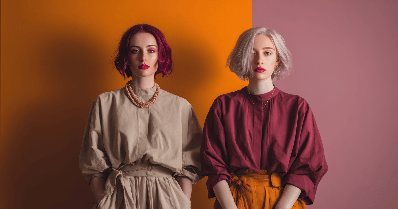
1 month agoThe business of colour analysis is booming - again
Colour analysis, a 1980s trend, has resurged as a popular service where experts determine whether individuals are Winter, Spring, Summer, or Fall based on skin, hair, and eye undertones to guide personal styling choices.
fromwww.aljazeera.com
2 months agoWhy is Cloud Dancer' the colour of the year?
We examine the online debate ignited by Pantone's Colour of the Year, Cloud Dancer. This episode dives into the discussion prompted by Pantone, unpacking the uneasy relationship between colour and fascism. From hardline efforts to regulate colour in public life to the ways vibrancy and maximalism reassert themselves, we explore how colour becomes a quiet form of resistance across art, fashion, film, and design.
Design
[ Load more ]