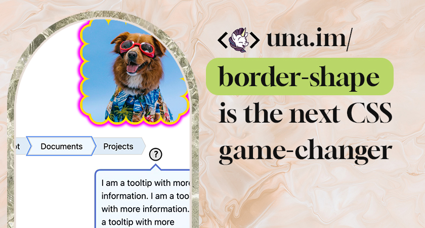
"border-shape is a powerful upcoming CSS primitive that defines a custom shape for an element's border. Unlike clip-path, which simply masks an element, border-shape actually redefines the "box" itself. When you apply a shape to a border, the background, the border-image, focus outline, and the box-shadow all follow that new geometry."
"The property accepts several values, including the shape() function: a powerful new way to draw complex paths directly in CSS, and path strings similar to SVG path data. Both are new and live within the same Level 4 specification as part of the CSS Borders and Box Decorations Module."
"corner-shape doesn't extend beyond corner styling, so you couldn't have a cut-out or extrusion in the middle-bottom of your element, or create non-normative shapes like a star. For more complex shapes, you'll want to reach for border-shape, which provides greater architectural flexibility than corner-shape's simple browser-provided shapes."
border-shape is an upcoming CSS property available in Chrome Canary 146+ that enables developers to create non-standard shapes for web elements. Unlike clip-path which masks elements, border-shape redefines the element's box itself, causing backgrounds, border-images, focus outlines, and box-shadows to follow the custom geometry. The property accepts shape() functions and SVG path strings for defining complex paths directly in CSS. While corner-shape handles simple corner styling, border-shape provides greater flexibility for creating complex shapes like cut-outs, extrusions, and non-normative designs. This represents a significant advancement in CSS border styling capabilities.
Read at Una
Unable to calculate read time
Collection
[
|
...
]