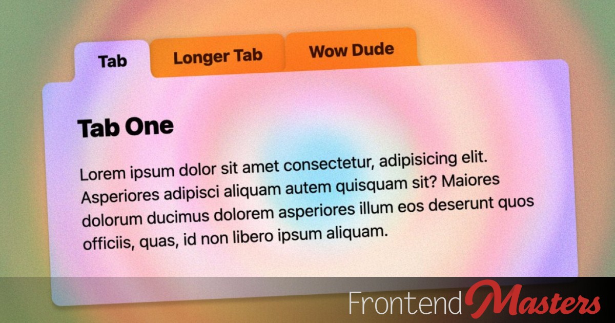
"Quite a while back I made a set of "round out" tabs, where the literal tab part of the UI would connect to the content below with a rounded edge that flared out as it connected. A bit tricky of a situation, even now! That old school solution used four additional elements per tab. Two to place a square on the bottom edges of the tab, and then larger circles to hide everything but the flared part."
"I'm so hyped on shape(). It's an amazing addition to CSS, giving us a primitive that can draw, well, anything you could draw with a pen tool. In our case we're going to use the shape() primitive with clip-path to carve a tab shape out of a rectangle. No extra elements! The shape() function takes all these commands to do the drawing. Depending on how complex a thing you are trying to do, the syntax is fairly human-readable."
"It's not completely fixed shape. Parts of it can be fixed coordinates, and other parts can be flexible. You'll see, it's awesome. We can variablize it, meaning we can adjust the look on the fly. Elements start out as rectangles. Ours are going to be horizontally longer rectangles just by virtue of them having text in them pushing them that direction. Then a bit of padding pushing those inline edges more than the block side edges."
Rounded, flared tabs can be produced by using the CSS shape() primitive with clip-path to carve a tab form out of an element's rectangle, eliminating extra masking elements. The shape() primitive accepts pen-tool-like drawing commands that are human-readable and allow a mix of fixed coordinates and flexible values. Variables can control aspects of the shape so the appearance can be adjusted on the fly. Elements naturally start as rectangles influenced by text width and padding, so carving should begin from the bottom-left and use curves or vertical-line commands to create the smooth "round out" connection to content.
Read at Frontendmasters
Unable to calculate read time
Collection
[
|
...
]